
The Image You Keep Coming Back To
What remains matters more than what was removed.

Welcome to This Week’s Edition of The Carty Method Magazine
Open Submission weeks tend to slow photographers down.
Not because the assignment is complicated, its because choosing becomes personal.
Without a prompt or restriction guiding the outcome, every submission reflects something deeper:
taste, confidence, restraint, and self-awareness.
The strongest images this week felt considered.
Not rushed toward attention.
Not overloaded with ideas.
Just resolved.
This week’s assignment returned members to Open Submission. An exercise built entirely around judgment and selection.
No required subject matter.
No creative direction.
No stylistic boundaries.
Only one responsibility:
Choose the image that best represents the level of work you want associated with your name.
Editing your portfolio honestly is one of the most creative skills a photographer can develop.
A lot of photographers improve technically long before they improve editorially.
They learn how to create stronger images, but not necessarily how to recognize which ones deserve to last.
Open Submission forces photographers into a different role:
not just creator, but curator.
It asks difficult questions:
Which images still work after the excitement fades?
Which photographs continue to communicate clearly over time?
Which ones genuinely belong beside the rest of your portfolio?
Because consistency is rarely built through addition.
It’s built through elimination.
Assignment Brief
At the end of each review session, CARTY delivers a focused brief, outlining exactly what shooters must create for the following week.
For this assignment, members returned to Open Submission.
Participants were invited to submit a single image that represents their strongest work, a photograph capable of standing confidently on its own while reflecting clarity, intention, and professional standards.
At the centre of Open Submission remains one question:
Does this image deserve a place in your portfolio?
The selected photographs this week shared a similar quality:
They felt complete.
Not because they were ov erly polished or complicated, but because every decision inside the frame felt intentional and necessary.
Nothing extra.
Nothing unresolved.

Mike Howell
What made this image the one that stayed with you after reviewing your work?
This picture was done using one optical, snoot and long exposure on a tripod.
I liked the blue overtones of the light, reminding you of the blue hour before nightfall.
How did you determine this photograph represented your current standard as a photographer?
My goal is to always improve.
My standard is to be better today than I was yesterday with a camera.
Steve teaches lighting, focus composition, but being able to put it all together can get tricky. This one worked.
What details or decisions helped the image feel complete rather than simply visually strong?
The strength of the Gobo light streaking across the wall, the focus on the glasses, the shadow of the martini glass in the edge of the main light…
There’s not a lot of shadow, but that one shows shadow which added another element to me
Was there anything you intentionally removed, simplified, or avoided to maintain clarity within the frame?
Yes.
The week before I had submitted a picture that had an entire scene around it and was full of errors.
What I took away from that was focus on the subject not the scene.
Minimalism is very intentional here avoiding too much clutter in the shot was absolutely my intention.
Was there a photographer, editorial campaign, or body of work that influenced your thinking while creating or selecting this image? What did you study, and how did you reinterpret those ideas through your own perspective?
I’m taking a lighting class online from Carl Taylor.
But I also looked at multiple other photographers drink images and background choices.
Then the gobo as the light modifier and the fixed lighting being at the right strength to where there was not too much whiteout became the focus for that element.
Social Media Handles:
Website: N/A
Instagram: N/A
Zandon De Waal
What made this image the one that stayed with you after reviewing your work?
It captured a moment that was initially in a chaotic state with high emotions.
How did you determine this photograph represented your current standard as a photographer?
It has definitely improved my choice of seeing fleeting moments.
What details or decisions helped the image feel complete rather than simply visually strong?
Framing.
Was there anything you intentionally removed, simplified, or avoided to maintain clarity within the frame?
No, but I wish I framed it a little better.
Was there a photographer, editorial campaign, or body of work that influenced your thinking while creating or selecting this image? What did you study, and how did you reinterpret those ideas through your own perspective?
Yes, Peter Lindbergh.
Social Media Handles:
Website: zandondewaal.com
Instagram: zandon_de_waal
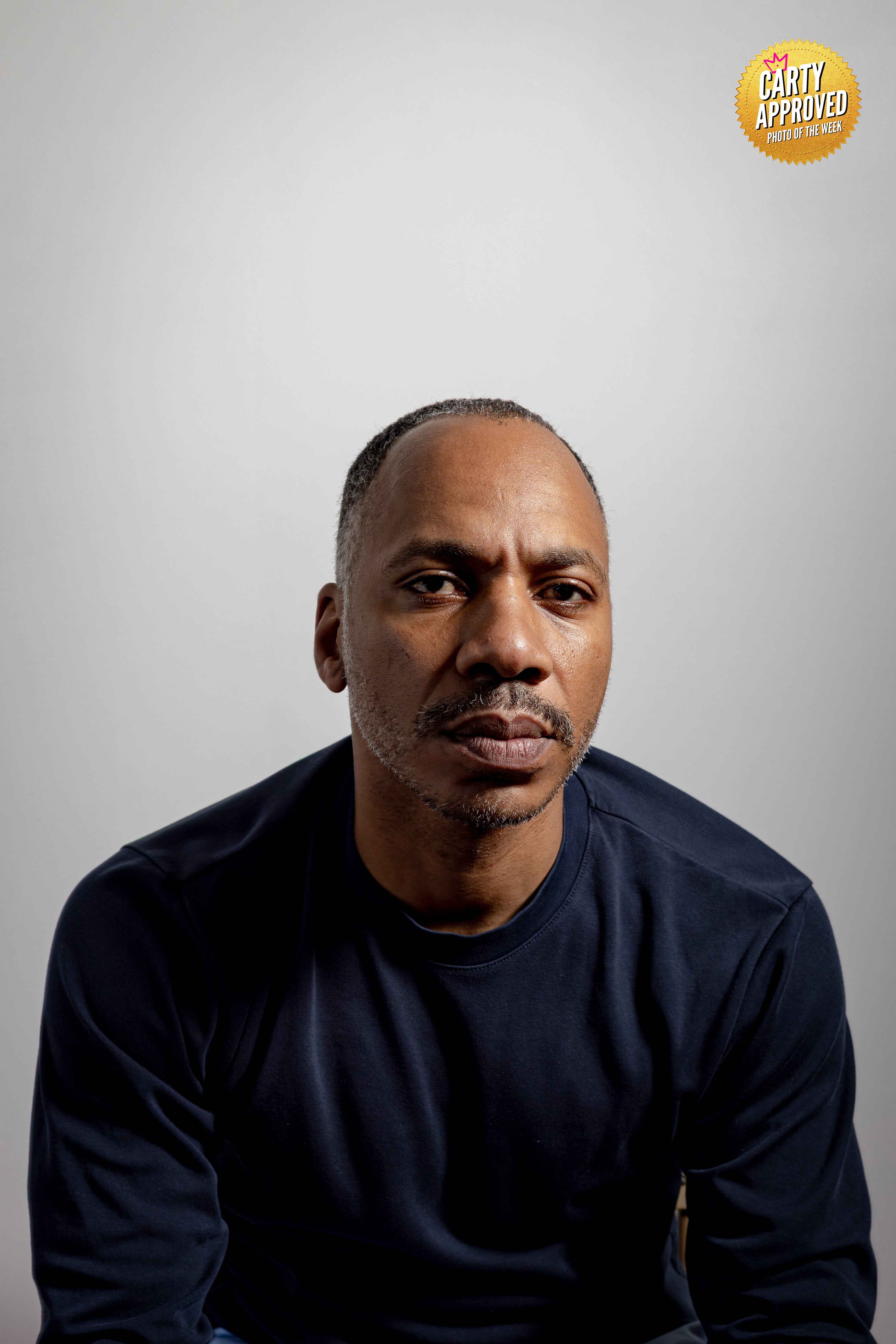
Roberto Carlos Castrejon-Perez
What made this image the one that stayed with you after reviewing your work?
He is the crew coach at St. Albans High School, always smiling and leading the kids with a great attitude.
I wanted to make him outstanding with a profile picture.
How did you determine this photograph represented your current standard as a photographer?
He was naturally smiling and showcasing his best attitude in front of the camera.
What details or decisions helped the image feel complete rather than simply visually strong?
I love the background light encompassing with the key and rim light added.
Was there anything you intentionally removed, simplified, or avoided to maintain clarity within the frame?
There was nothing to remove from the frame.
Like Carty said during the review, I should shot it with more air to the sides to prevent the claustrophobic feeling for his arms.
Was there a photographer, editorial campaign, or body of work that influenced your thinking while creating or selecting this image? What did you study, and how did you reinterpret those ideas through your own perspective?
I am still focusing on the work by Plato, Lipsky, and Rankin.
Social Media Handles:
Website: portraits-rc.com
Instagram: portraits.rc
Michael Walls
What made this image the one that stayed with you after reviewing your work?
This picture stood out because the placement of the subject in the frame.
I also really liked that the action around the chainsaw and catching all of the debris from the tree and it displays his style of work clearly.
How did you determine this photograph represented your current standard as a photographer?
As an editorial photographer, it was perfectly placed for a cover page, the companies brand was front and centre and the exposure was right to make a good photo.
What details or decisions helped the image feel complete rather than simply visually strong?
I feel that with how violent chainsaws can move, it looks like it is not moving at all and you can see the chaos it is causing with the debris of the tree flying out the side
Was there anything you intentionally removed, simplified, or avoided to maintain clarity within the frame?
I did get close enough to not show the houses the tree was in-between to cut out any distractions that would take the eye away from the business owner.
Was there a photographer, editorial campaign, or body of work that influenced your thinking while creating or selecting this image? What did you study, and how did you reinterpret those ideas through your own perspective?
Not really.
This was an unplanned shoot for a company that came to my house to cut down some trees and I seen they had no social media presence or website images.
So I worked a trade on the fly to provide them with images and save me some money on the tree project.
My coach Steve Carty influenced it by the training I receive in portfolio lab and making sure the subject is placed correctly for a cover page and the subject is tact sharp.
Social Media Handles:
Website: michaelwallsphotography.com
Instagram: wallsofmemoriesphotograhpy
Sean Thomas
What made this image the one that stayed with you after reviewing your work?
More than anything, it represents where I’m going.
As I build a new portfolio around people, lifestyle, and community, this image feels aligned with that vision.
How did you determine this photograph represented your current standard as a photographer?
More than anything, it represents where I’m going.
As I build a new portfolio around people, lifestyle, and community, this image feels aligned with that vision.
What details or decisions helped the image feel complete rather than simply visually strong?
The expression and body language carried most of the weight.
By keeping the composition simple, the portrait was able to communicate character without relying on additional elements.
Was there anything you intentionally removed, simplified, or avoided to maintain clarity within the frame?
I avoided unnecessary distractions and focused on creating a clean portrait that allows the viewer to connect directly with the subject.
Simplicity became part of the storytelling.
Was there a photographer, editorial campaign, or body of work that influenced your thinking while creating or selecting this image? What did you study, and how did you reinterpret those ideas through your own perspective?
I recently did a deep dive through Steve Carty's body of work and paid close attention to how he uses simplicity, authenticity, and human connection to create meaningful portraits.
Social Media Handles:
Website: www.autoluximagery.com
Instagram: autoluximagery

Michael Stimatze
What made this image the one that stayed with you after reviewing your work?
What made this my favourite from this shoot was the look on Amelia’s face.
Photographing babies is almost as much luck as skill.
They don’t take direction that well, after all.
I think she was as surprised as we were.
How did you determine this photograph represented your current standard as a photographer?
The lighting was almost perfect.
I purchased a 72” umbrella for this shoot.
Newborn/baby photography typically uses a soft light.
I needed as much diffusion as I could get. This photo was pretty much what I was looking for.
What details or decisions helped the image feel complete rather than simply visually strong?
Mom propped her up and we expected that we would not get much time.
Then she held the pose for long enough that I could get a better frame.
The look she has on her face tells the story.
She was as surprised with this new to her position as any of us involved.
Was there anything you intentionally removed, simplified, or avoided to maintain clarity within the frame?
We used a blanket to create an almost seamless background so that there was a non-distracting background.
Was there a photographer, editorial campaign, or body of work that influenced your thinking while creating or selecting this image? What did you study, and how did you reinterpret those ideas through your own perspective?
I have been looking at several photographers recently that specialize in newborn/baby photography.
Anna Brandt is the biggest inspiration for this particular shot, though not the exact pose more so in the feel of the frame. Anna’s lighting has been my inspiration recently.
A local photographer, Melissa Donner, has been an influence.
Social Media Handles:
Website: michaelstimatze.com
Instagram: mestimatze
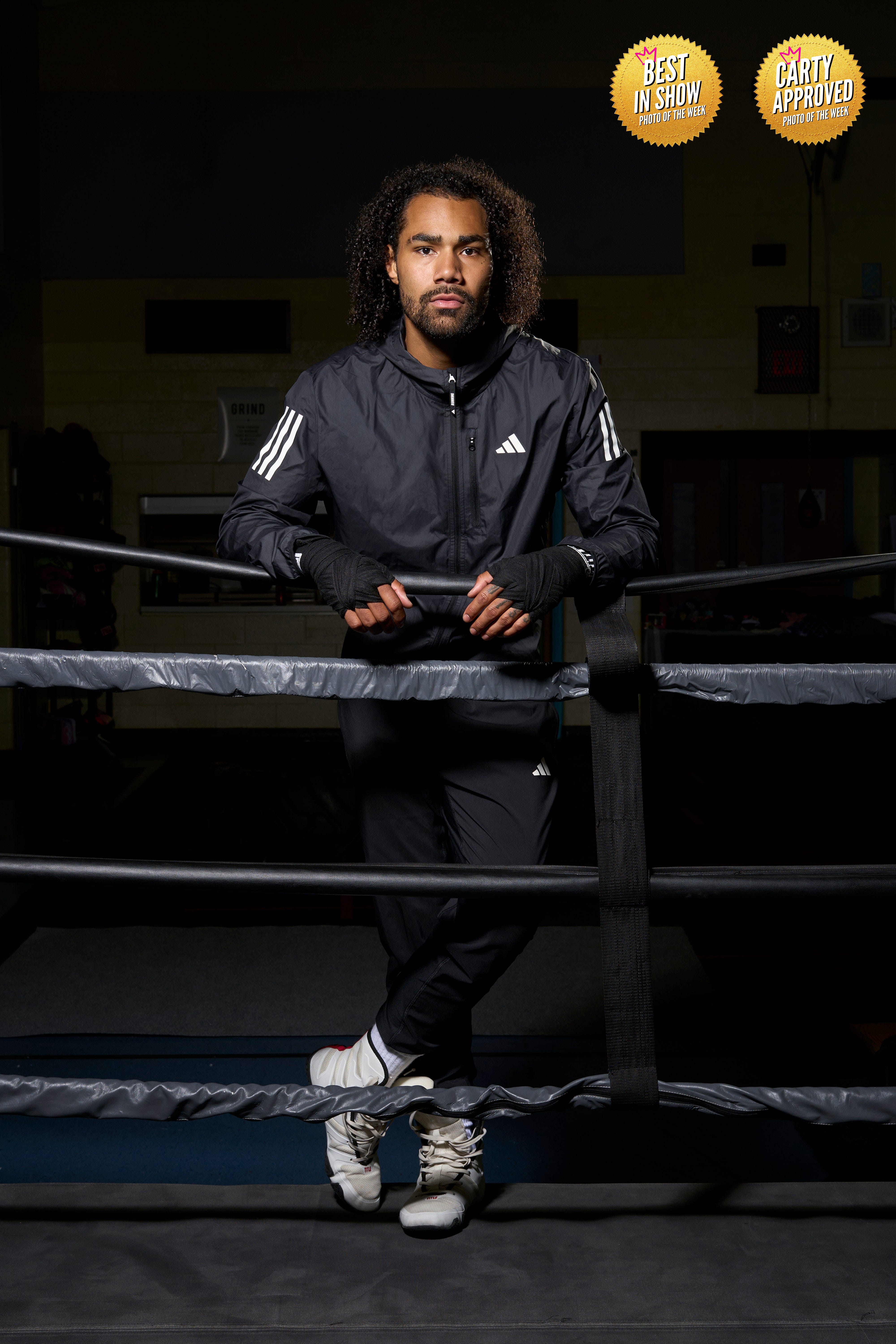
Malik Brand
What made this image the one that stayed with you after reviewing your work?
It was me applying everything that Carty has been hammering into my brain, and it was exactly what I was going for a strong, commercially viable portrait of the athlete.
How did you determine this photograph represented your current standard as a photographer?
I think Carty has helped with this, because I set the bar WAY higher than I used to, and the level of work I’ve been studying shows me what the Top 1% looks like.
So I am always looking to have work on par with them.
What details or decisions helped the image feel complete rather than simply visually strong?
I wanted to make sure I highlighted the fighter’s vibe and environment, but I also wanted it to look like an adidas ad, so the outfit was extremely important.
Was there anything you intentionally removed, simplified, or avoided to maintain clarity within the frame?
Well, his gym is still in progress, so we moved a lot of stuff out of the background.
But I also had to make sure that the tracksuit wasn’t wrinkled, so we really ironed and steamed that thing.
Was there a photographer, editorial campaign, or body of work that influenced your thinking while creating or selecting this image? What did you study, and how did you reinterpret those ideas through your own perspective?
I’ve been studying a lot of Matt Hawthorne’s work.
I’ve also been looking at a lot of adidas and Nike ads as well.
Social Media Handles:
Website: malikbrandphotography.com
Instagram: Malik.a.brand
Professional feedback will change your reality. Joining Portfolio Lab is the only way.
👉🏾 Carty a Pro Photographer, Director, and Educator based in Toronto, CA.
His goal is to educate and connect a global network of visual creators.
👉🏾 Masterclass Level Photography Business Education from a 36yr Pro 👈🏾 on YouTube
See work at 👉🏾 SteveCarty.com
Work with him 👉🏾 TheCartyMethod.com
Subscribe to The Carty Method Magazine to see the best new photographers from all over the world level up right before your eyes. Weekly photographer transformations are happening right now.
Become a smarter photographer in 5 minutes a week by Subscribing to CARTY on The Carty Method - Substack.
Watch the replay of these photo submissions below.