
Selection Is the Real Skill
The difference between shooting and editing is judgment.

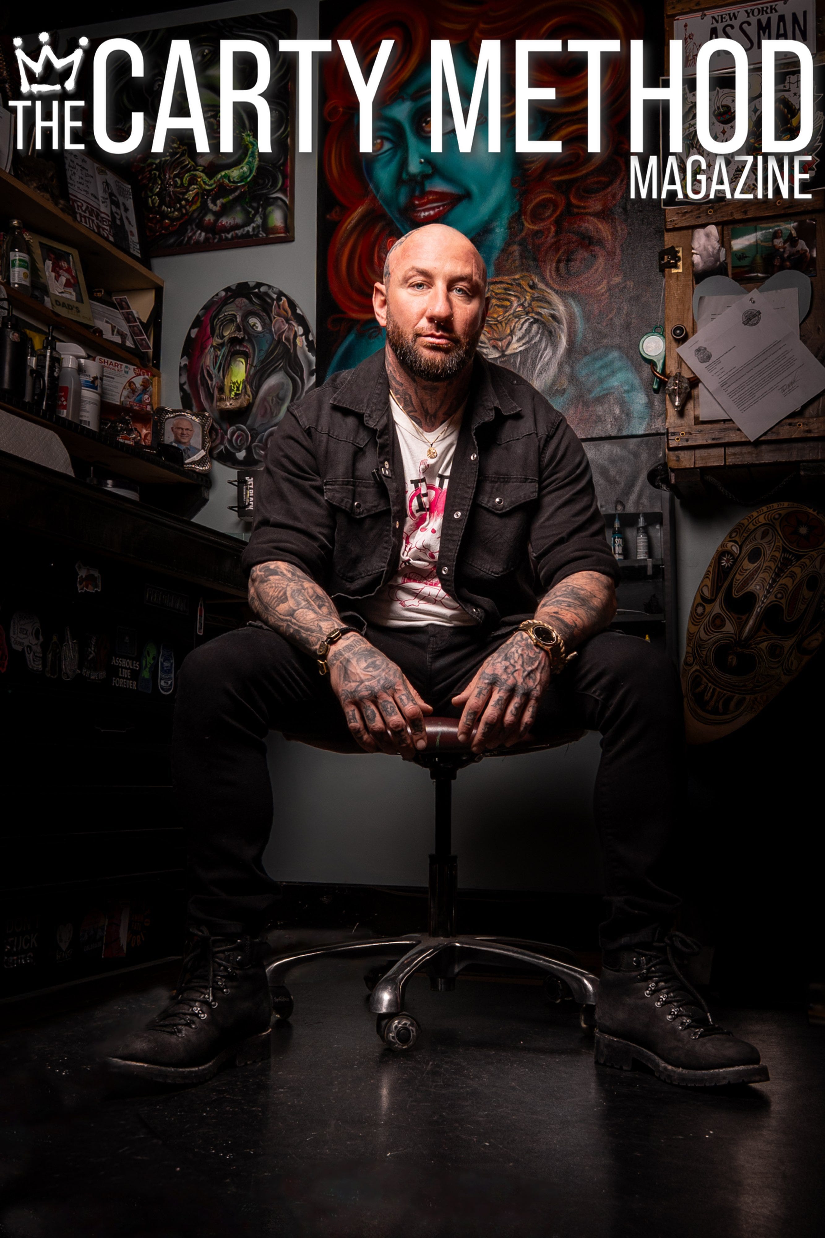
Welcome to This Week’s Edition of The Carty Method Magazine
Open Submission weeks tend to reveal more than expected.
Without a prompt directing the outcome, photographers are left with a different responsibility: deciding what deserves to represent their work.
Not the loudest image.
Not the newest one.
The strongest one.
That distinction shaped this week’s submissions.
Some photographs created immediate impact. Others gained strength through simplicity, restraint, and clarity the longer you stayed with them.
That staying power is difficult to fake.
For this assignment, photographers returned to Open Submission.
An exercise built entirely around selection and self-editing.
No creative brief.
No stylistic requirements.
No predefined subject matter.
Only one decision:
Which image best reflects your standard as a photographer?
A portfolio becomes stronger the moment you stop trying to include everything.
Why This Matters
Photographers often spend years developing technical ability, but far less time developing discernment.
Knowing when an image works and when it doesn’t, is its own skill.
Open Submission shifts the focus away from creating for approval and toward curating with intention.
It challenges photographers to evaluate their own work honestly and identify the images that communicate with clarity, confidence, and consistency.
Because professional portfolios are rarely defined by quantity.
They’re remembered for precision.
Assignment Brief
At the end of each review session, CARTY delivers a focused brief, outlining exactly what shooters must create for the following week.
For this week, members returned to Open Submission.
Participants were invited to submit a single image that represents their strongest work.
A photograph capable of standing confidently on its own without relying on explanation or context.
At its core, Open Submission continues to revolve around one question:
Does this image belong in a portfolio?
The strongest submissions this week shared one thing in common:
Clarity.
Not just in composition or technique, but in intention.
The selected images felt resolved. Focused. Complete.
They knew exactly what they were trying to say and stopped there.
Donna Crantshaw
What made this image the one you chose to stand behind this week?
I picked this image because Carty is always encouraging me to try something new, like changing up my angle or focusing more on the product’s texture.
At what point did you recognize this image was stronger than the others from the shoot or series?
I really wanted the texture to come through, so I played with a bunch of angles and even tried a smear.
This one ended up being the strongest, vertical format and all.
What decisions helped the image communicate clearly without explanation?
My goal was for the textured drip to instantly signal what the product is.
What did you intentionally leave out, simplify, or avoid to strengthen the photograph?
I wanted a simple, distraction‑free background, so I used a softbox as the backdrop and framed it with black card strips to get that clean side highlight on the container.
The white surface below picked up the overhead continuous light and gave me the reflection at the bottom.
Was there a photographer, campaign, or reference image that influenced your approach? What did you study, and how did you reinterpret those ideas through your own style?
There was a similar image on the Fenty site that had the drip that influenced me.
Social Media Handles:
Website: www.donnacrantshawphotography.com
Instagram: donnacrantshawphotography
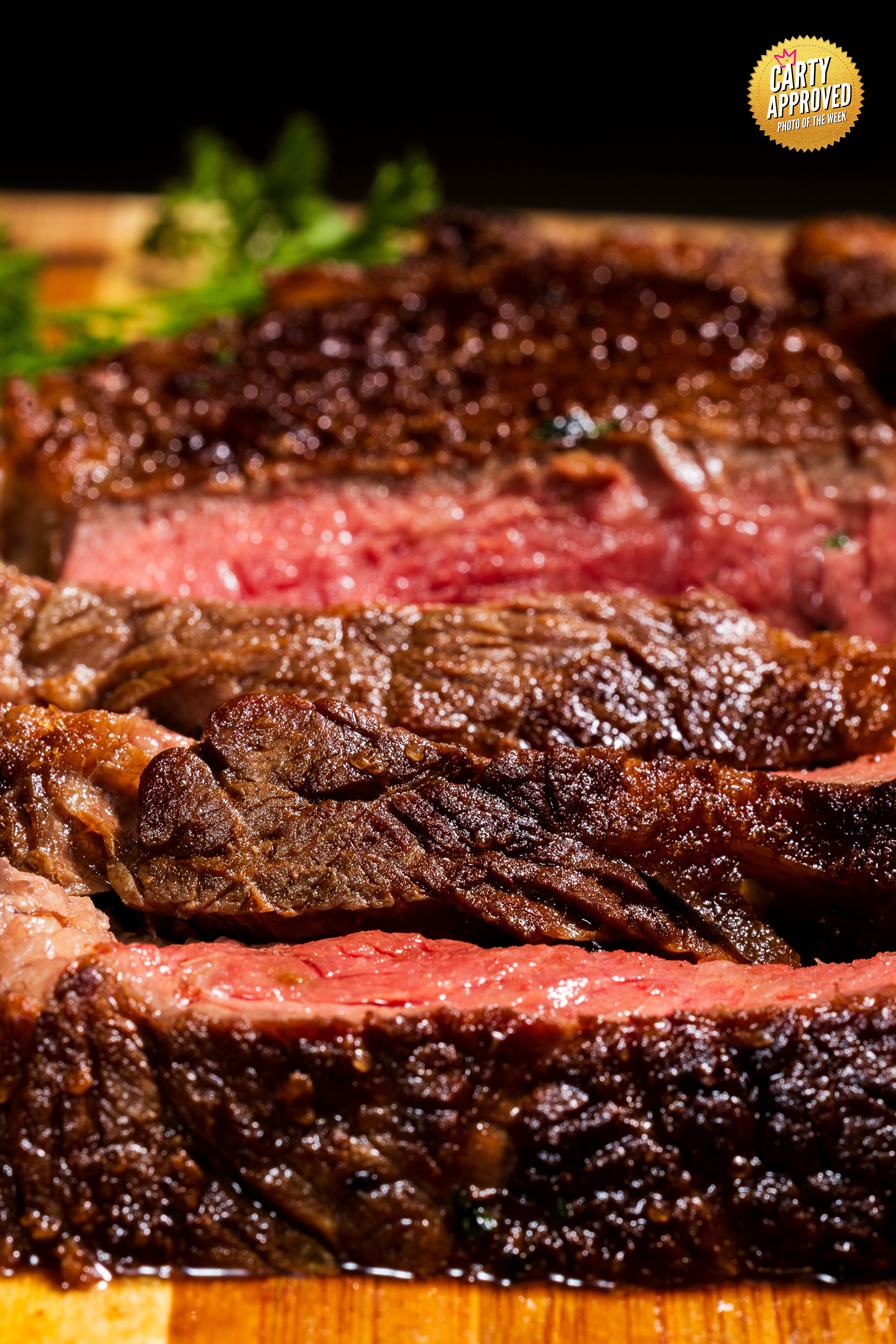
Michael Walls
What made this image the one you chose to stand behind this week?
I really liked the angle of the shot and the details that were picked up on the outside the steak and the juices inside of it as well.
I feel that it would be an image that would stop the scroll and make the viewer want a steak for dinner.
At what point did you recognize this image was stronger than the others from the shoot or series?
As soon as I seen it in the back of the camera.
I was working different angles going from top down, sides etc.
But this one stood out immediately as the winner when I loaded all the photos to the computer.
What decisions helped the image communicate clearly without explanation?
I feel that almost filling the entire frame with the steak without any other distractions and focusing on the texture.
What did you intentionally leave out, simplify, or avoid to strengthen the photograph?
I left out the entire table with the rest of the meal and made sure the steak was the star.
Was there a photographer, campaign, or reference image that influenced your approach? What did you study, and how did you reinterpret those ideas through your own style?
This idea came from our inspiration class with Carty, he scrolled through several photographers and images.
During this class it opened my eyes to the possibilities of my portfolio that I am building.
It was perfect timing because I was planing on cooking steak the same night and it turned out to be the best looking photo in my portfolio so far.
Social Media Handles:
Website: michaelwallsphotography.com
Instagram: wallsofmemoriesphotograhpy
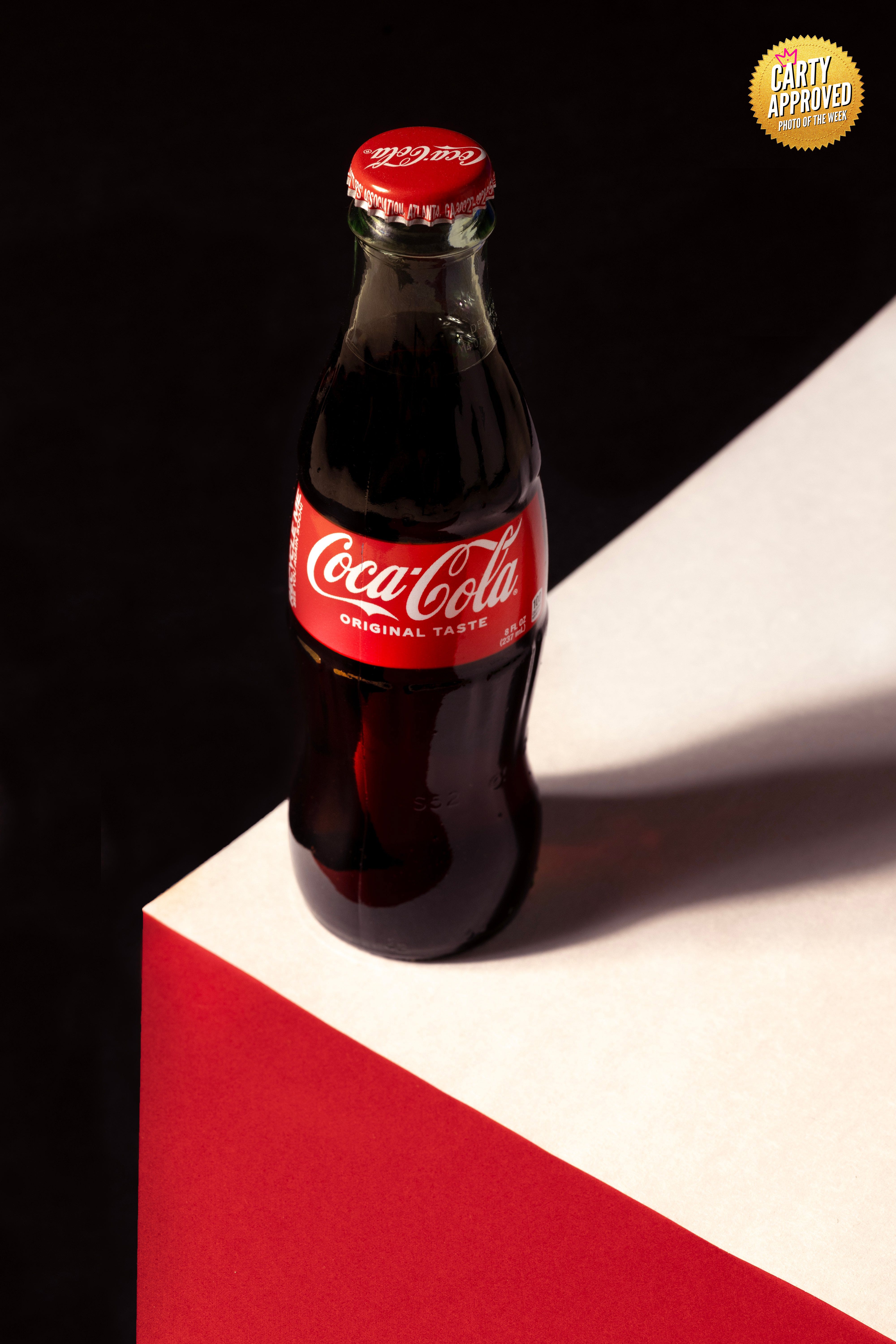
Francis Jeffery
What made this image the one you chose to stand behind this week?
The fact that when I edited it the soft shadow was the difference maker.
I did get photos I thought were better but I wound up not having time to edit them and share them due to them being gotten later in the week and my work schedule, so I might submit one of them for a future open submission.
At what point did you recognize this image was stronger than the others from the shoot or series?
When studied the perspective and realized it would be relatively easy for me to use the healing brush tool in Adobe Photoshop to rid the gap between sheets of paper and could make the background look virtually black apon moving Adobe Photoshop RAW sliders around.
I do believe I mistakenly handed in the wrong edited file because I swear that the black was virtually black instead of a textured black.
What decisions helped the image communicate clearly without explanation?
The Color Palate, imaginary table.
What did you intentionally leave out, simplify, or avoid to strengthen the photograph?
Specs of dirt that got on the bottle and sheets of paper that I cloned out in post production.
I wound up using constant lighting for the final image because my strobe lights were much brighter making the fibrous texture of the paper stand out.
Was there a photographer, campaign, or reference image that influenced your approach? What did you study, and how did you reinterpret those ideas through your own style?
Yes and yes.
The reference image was the same composition except they used Old Spice deodorant instead of Coca-cola.
The colour palate was the same for each product so I thought I’d just use Coca-cola.
The Design also reminded me of the video game called Qbert so i thought I’d use abstract realism to make the caffeinated soda bottle look tall and lanky like that monster that goes after Qbert while he’s jumping on the blocks.
Social Media Handles (Instagram, Website,Etc)
https://500px.com/p/photogenicconnections_com_francisjeffery?view=photos
Social Media Handles:
Website: 500px.com/photogenicconnections
Instagram: francisjefferythebest
Instagram: scenery_michiana_portraits
Sean Thomas
What made this image the one you chose to stand behind this week?
This image represented a shift for me creatively.
Instead of focusing on the cars themselves, I focused on the people and the atmosphere surrounding the community.
It felt honest, relaxed, and naturally connected to car culture in a way that reflects the direction I want to continue exploring.
At what point did you recognize this image was stronger than the others from the shoot or series?
The moment I noticed how naturally everyone “seemed” to be interacting with each other.
Basically, this frame doesn’t looked staged.
What decisions helped the image communicate clearly without explanation?
I kept the composition simple and let the body language, spacing, and environment tell the story.
Including small details like the partial car framing, helped ground the image in car culture without needing the them to dominate the frame.
What did you intentionally leave out, simplify, or avoid to strengthen the photograph?
I avoided over-editing or trying to make the scene feel more dramatic than it already was.
The goal was to create authenticity and a believable candid interaction.
Was there a photographer, campaign, or reference image that influenced your approach? What did you study, and how did you reinterpret those ideas through your own style?
I’ve been studying more lifestyle and documentary driven automotive photography in general lately.
Especially work that prioritizes people, atmosphere, and culture over just the vehicles themselves.
Social Media Handles:
Website: www.autoluximagery.com
Instagram: autoluximagery

Aleksandar Klasnja
Social Media Handles:
Website: N/A
Instagram: N/A
RC Castrejon-Perez
What made this image the one you chose to stand behind this week?
I love the coxswain look, all geared up!
It is not only about the rowers power, but the coxswain know how the get the best of each one of them, and this is the equipment help them to achieve the best of the team.
At what point did you recognize this image was stronger than the others from the shoot or series?
It is not only the coxswain but also the gear to get the best of the rowers.
What decisions helped the image communicate clearly without explanation?
In rowing, the coxswain is often underrepresented in sports photography, and I wanted to me her shine this time.
What did you intentionally leave out, simplify, or avoid to strengthen the photograph?
Unfortunately, I cropped to tight to her knees and leave to little space to include the suit brand more at the center of the picture.
Was there a photographer, campaign, or reference image that influenced your approach? What did you study, and how did you reinterpret those ideas through your own style?
I have been focusing on the portraiture by Platon, Lipsik, and Rankin.
Social Media Handles:
Website: portraits-rc.com
Instagram: portraits.rc
Hal Banfield
What made this image the one you chose to stand behind this week?
This was a very complex shoot from a standpoint of working with a team and the logistics involved.
We did not have a lot of time with this final setup, and this image was just one of a few I was considering for the assignment.
At what point did you recognize this image was stronger than the others from the shoot or series?
Looking back at all that we had gathered from this setup, I knew for the assignment I would want to showcase as much of the model as possible in terms of featuring the styling and matching it to the vibe we were trying to capture on set.
With the limited time left on the clock, this image, in my opinion, turned out to be the strongest of the sequence.
What decisions helped the image communicate clearly without explanation?
In collaboration with the team, I wanted to utilize the colors of the garment and incorporate the colour green into my background.
As the dress was made of sequins, and her nails had some sparkle to them, I decided hard light was going to be the way to go to really pick up the shimmer of the dress.
And at the last minute, I brought in a star reflector to try to catch some additional light reflections off the dress.
What did you intentionally leave out, simplify, or avoid to strengthen the photograph?
There were a lot of extra items on set (chairs, ladders, props) that I felt were distracting.
I felt the dress and styling was enough of a story and had the items removed from the set.
My only wish is that we had more time with this look.
Was there a photographer, campaign, or reference image that influenced your approach? What did you study, and how did you reinterpret those ideas through your own style?
A photographer I admire is Pari Dukovic.
I truly appreciate his use of motion through colour and light.
He also encourages his subjects to use their bodies, which I am working at incorporating into my own photo practice.
Social Media Handles:
Website: halbanphotography.com
Instagram: halbanphotography
Khaligraphy
Social Media Handles:
Website: khaligraphy.art
Instagram: khaligraphy
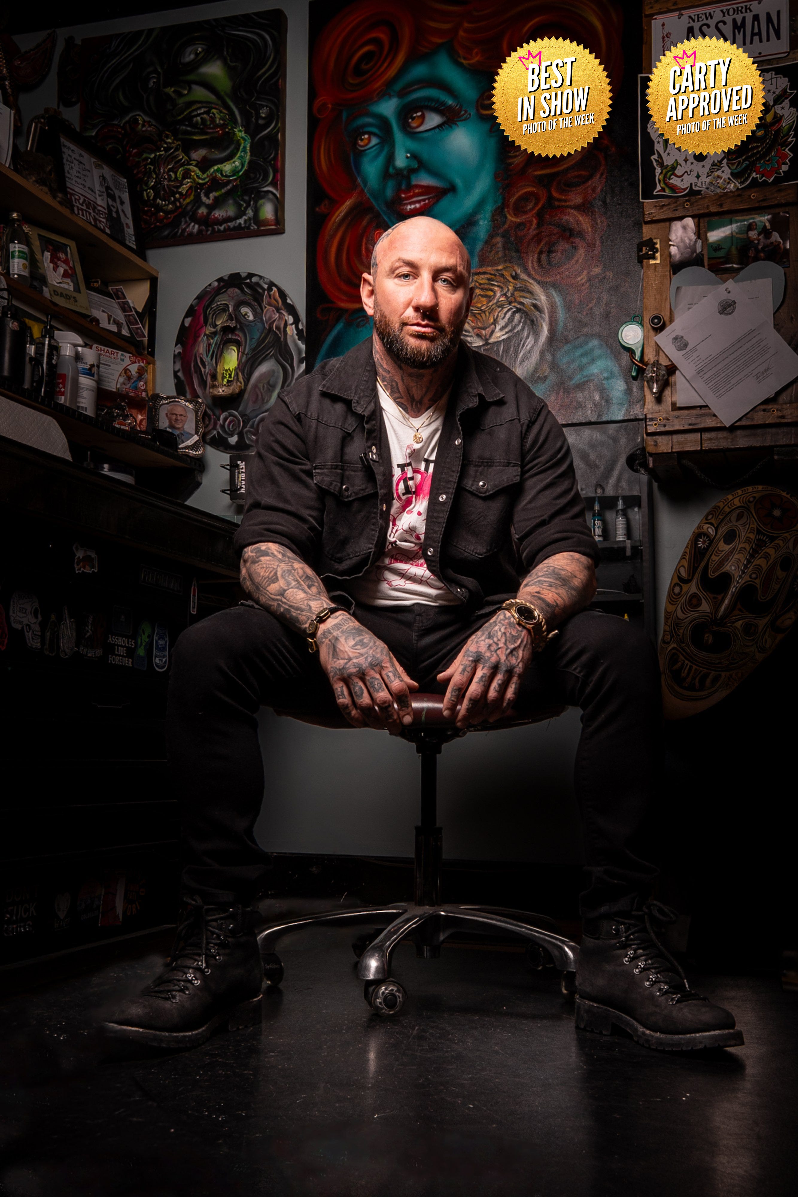
Jim Sinicki
What made this image the one you chose to stand behind this week?
I love environmental portraits, and when I went into this job this was the first image I had in my mind.
I wanted to tell his story in a minimalistic way.
When you look at this image you know what he does for a living, but we don’t show him in the act.
This was the goal the entire time
At what point did you recognize this image was stronger than the others from the shoot or series?
When I looked at this image in the back of the camera I just knew this was the one.
I knew I wouldn’t have to spend a ton of time editing it and I knew it wold tell his story.
What decisions helped the image communicate clearly without explanation?
Simplicity was a key as it is in all of my images.
I could have shown him tattooing someone one and I could have put a tattoo gun in his hand, but would that bring anymore to this photo than what we already see?
We can tell this is a tattoo artist and we can tell his passion for the art without it.
What did you intentionally leave out, simplify, or avoid to strengthen the photograph?
The extra noise.
Isolating the subject was the key.
Was there a photographer, campaign, or reference image that influenced your approach? What did you study, and how did you reinterpret those ideas through your own style?
There’s a bunch of photographers who I channeled to make this image.
I tried to think back to the ones who I’ve seen do this style and I knew I wanted to go along the lines of high contrast and bold colours.
Social Media Handles:
Website: charliejamesphoto.com
Instagram: charlie_james_photo
Substack: Charlie James Photo
Professional feedback will change your reality. Joining Portfolio Lab is the only way.
👉🏾 Carty a Pro Photographer, Director, and Educator based in Toronto, CA.
His goal is to educate and connect a global network of visual creators.
👉🏾 Masterclass Level Photography Business Education from a 36yr Pro 👈🏾 on YouTube
See work at 👉🏾 SteveCarty.com
Work with him 👉🏾 TheCartyMethod.com
Subscribe to The Carty Method Magazine to see the best new photographers from all over the world level up right before your eyes. Weekly photographer transformations are happening right now.
Become a smarter photographer in 5 minutes a week by Subscribing to CARTY on The Carty Method - Substack.
Watch the replay of these photo submissions below.