
EDITORIAL MAGAZINE COVER
There is nothing more editorially powerful than the magazine cover. This week's pro level assignment was "Your niche on a magazine cover" Here are the best results.

Welcome to This Week’s Edition of The Carty Method Magazine!
This week, we challenged photographers to shoot a Cover Photo within their niche.
A cover photo is the first impression, a crucial step in establishing photography work for print.
It’s an essential skill for photographers to know how to create and capture impactful cover images that demand attention.
After all, you can’t just put any picture on the cover. It needs to tell a story, spark curiosity, and leave a lasting impression.
Ready to be inspired by this week’s photographers and their incredible cover photos?
Let’s begin!
Assignment Brief
CARTY gives a tight brief at the end of his photo review shows which tells us shooters what we have to shoot exactly for the following weeks review.
Here is this assignment exactly how he shares it.
“This weeks Assignment: A Cover Photo”.
“Covers are the ultimate test of a photographer’s ability to merge art and commerce.
You’re not just making a picture, you’re creating a visual handshake between the subject and the audience.” – The Carty Method
This assignment develops critical skills for editorial and advertising work while pushing you to think like an art director.
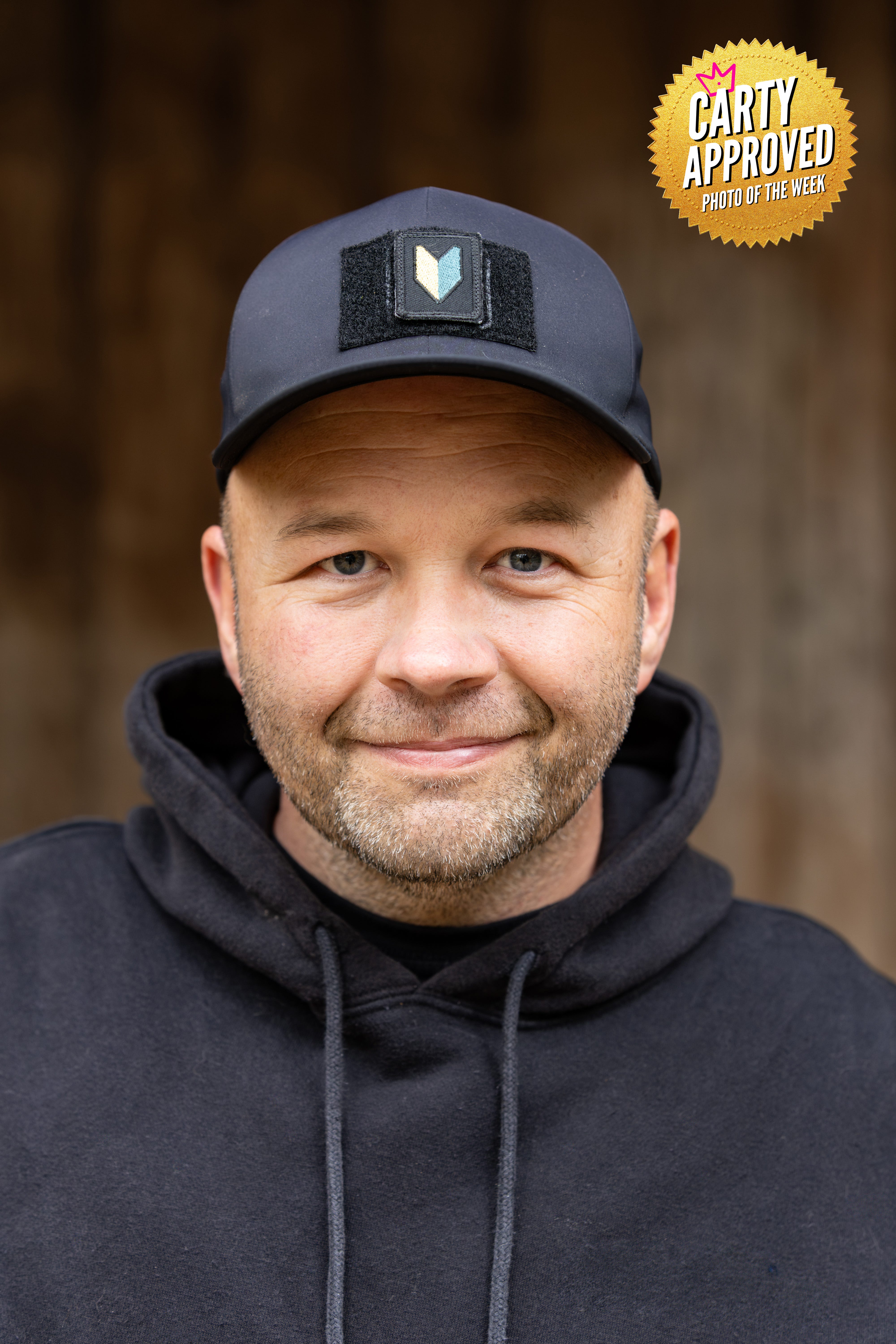
Steve Bourdeau
What was the main story or message you wanted your cover image to communicate at first glance?
Warm, inviting, relatable vibes were the direction I was going with this image.
I wanted the viewer to wonder what stories lay behind the eyes.
How did you design your shot to work as a magazine cover, especially with text and branding in mind?
Simplicity is king and I tried to not overthink and overcomplicate the image.
The non distracting background and wardrobe were key to making the image work in my eyes.
All while leaving room for masthead and text.
Which styling, lighting, or composition choice made the biggest impact on your final result?
It was already overcast, so I didn’t have to find an alternate spot with open shade, but I ended up using a spot that would have one shade anyway.
This allowed the background light to fall off allowing of greater separation of the subject.
What publication (or brand) inspired your creative direction and how did you make it your own?
Although I didn’t include any branding, I had Carhartt or another outdoor clothing brand in mind.
I can also see an outdoor/adventure magazine using this for a story.
What did this assignment teach you about thinking like a commercial/editorial photographer?
It reminded me that the first image is never the final and to keep working through the image until I had something I was truly happy with.
Social Media Handles:
IG: Steve.bourdeau.photography
Website: SteveBourdeau.com
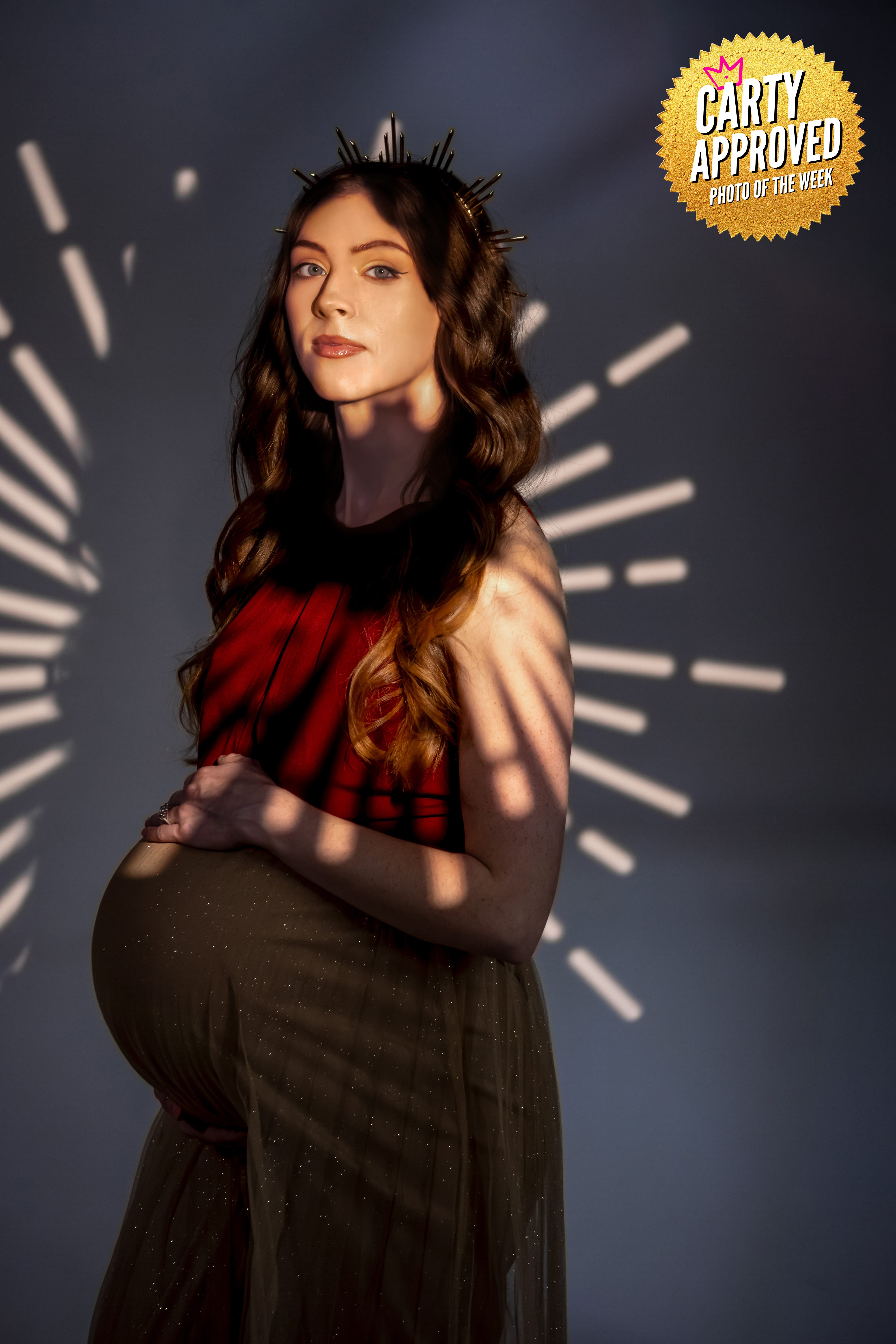
Natalie Bennett
What was the main story or message you wanted your cover image to communicate at first glance?
I wanted the image to illustrate the beauty of motherhood, and convey the message that women are attractive at every stage in their life.
The mother- to -be was in her 9th month of pregnancy and I wanted to highlight her elegance, her quiet strength and her resilience.
The young model embraced her unborn child as she looked forward to bringing a new life into the world.
How did you design your shot to work as a magazine cover, especially with text and branding in mind?
Illuminated by a single, deliberate beam of light, the expectant model stands adorned with a crown.
By placing a crown on her head, the photograph elevates pregnancy from a biological state to a symbol of dignity, honor and strength while emphasizing her presence as the central figure.
Which styling, lighting, or composition choice made the biggest impact on your final result?
The simplicity of the studio setting draws focus entirely to the model, with the intent of celebrating motherhood and the model as a radiant source of life.
The use of the optical spotlight with the starburst depicts the mother-to-be as majestic and regal as she embraces her baby bump.
What publication (or brand) inspired your creative direction and how did you make it your own?
I wanted to emulate several magazines such as Vogue, Mom & Baby and Fit Pregnancy.
What did this assignment teach you about thinking like a commercial/editorial photographer?
Doing this assignment taught me to think like an editorial photographer because it pushed me to create an image with a deliberate story, message, and emotional tone.
Social Media Handles:
IG: https://www.instagram.com/nataliabennettphoto/
Website: https://natalie-bennett.pixpa.com
Wedding Website: https://photographybynatalia.lightfolio.com/
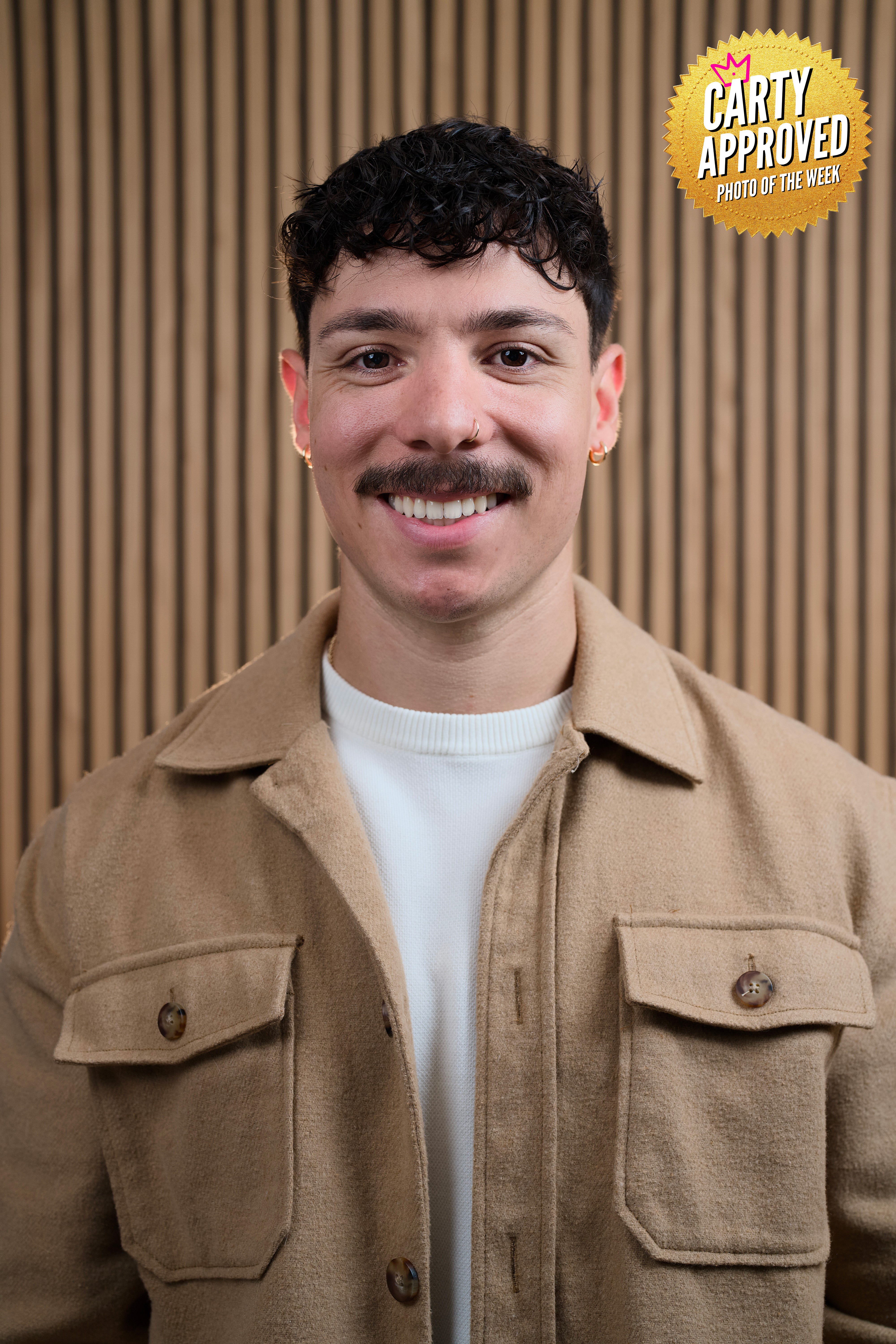
Kyle Kiyono
What was the main story or message you wanted your cover image to communicate at first glance?
This is an influencer in his podcast scene.
How did you design your shot to work as a magazine cover, especially with text and branding in mind?
I figured with Carty’s intense & healthy criticism in mind, I ought to capture the frame with his voice behind every click.
Which styling, lighting, or composition choice made the biggest impact on your final result?
I don’t own any lights, so having this influencer’s setup with his lighting was a unique experience for me.
It helped me grow as a photographer.
What publication (or brand) inspired your creative direction and how did you make it your own?
Business insider. I noticed how the composition of many of their headshots had an authoritative position.
And I wanted to share that, while giving the clients what he was looking for too.
What did this assignment teach you about thinking like a commercial/editorial photographer?
It enabled me to see a matrix of sorts; such as, leaving breathing room for text or anything the creative director would be free to do.
Social Media Handles:
IG: @KiyonoPhotography
Website: www.kiyonophotography.com
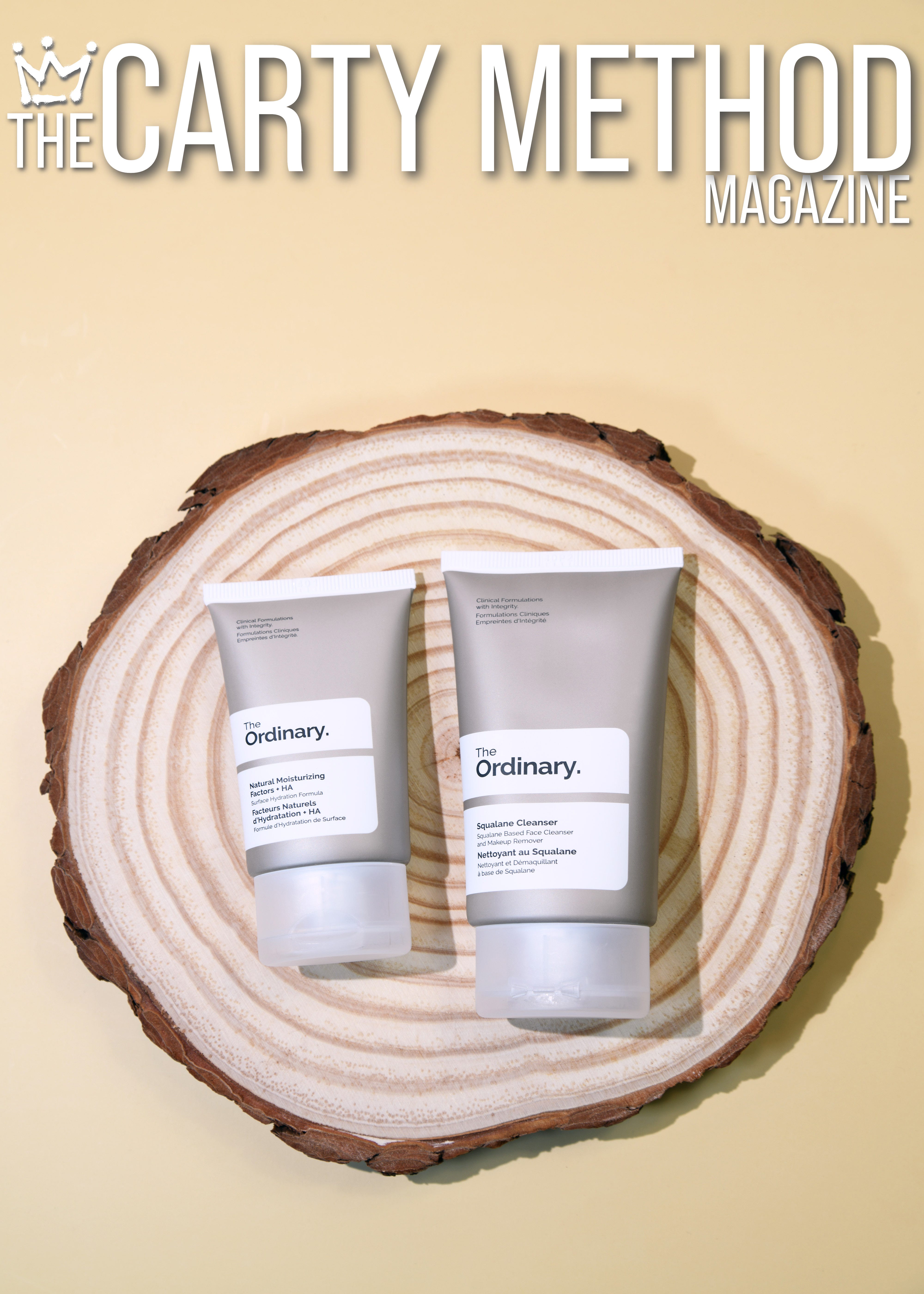
Best In Show
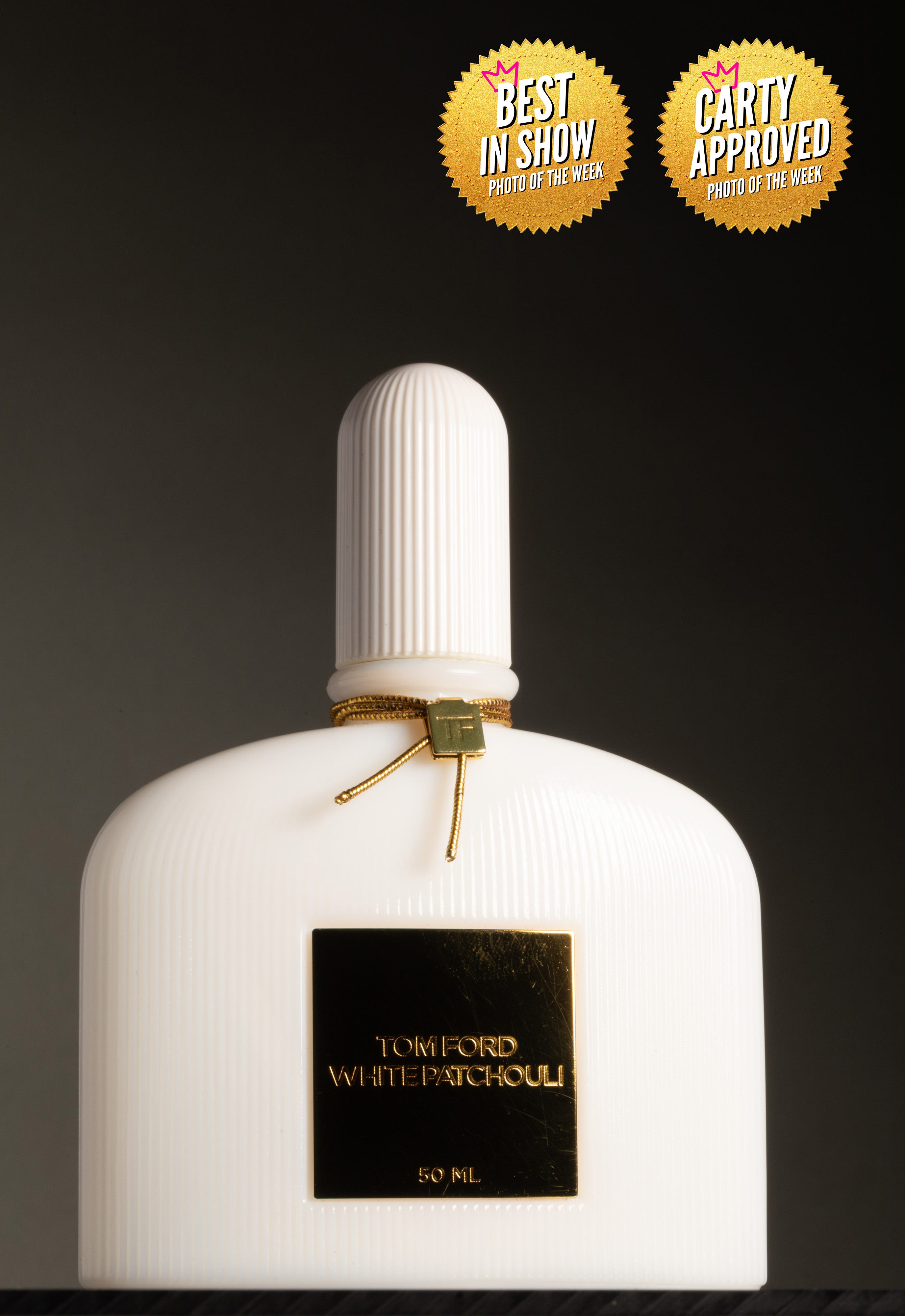
Donna Crentshaw
What was the main story or message you wanted your cover image to communicate at first glance?
It’s luxury, sophisticated, and modern, so I wanted to communicate that with a closeup shot of the product.
How did you design your shot to work as a magazine cover, especially with text and branding in mind?
I learned that a magazine cover had to be vertical and it has have to enough space top and bottom for additional text and the masthead.
Which styling, lighting, or composition choice made the biggest impact on your final result?
I like a minimalistic look and sometimes less is more.
I’m finding that I didn’t need to use bunch of props to get a message across, I think the product spoke for itself.
My setup is really simple I only used one strobe light, a defuser & a 100mm lens.
What publication (or brand) inspired your creative direction and how did you make it your own?
I looked at some magazines like Essences, Vogue; I also looked at the Tom Ford website and a couple of products photographer just to see how they photograph different perfume bottles.
What did this assignment teach you about thinking like a commercial/editorial photographer?
It’s not easy at all! There are so many commercial photographers and they create some amazing work.
It makes me want to work hard so I can be the best and be able to help those small & upcoming businesses.
Social Media Handles:
IG: @donnacrantshawphotography
Website: www.donnacrantshawphotography.com
Professional feedback will change your reality. Joining Portfolio Lab is the only way.
👉🏾 Carty a Pro Photographer, Director, and Educator based in Toronto, CA.
His goal is to educate and connect a global network of visual creators.
👉🏾 Masterclass Level Photography Business Education from a 35yr Pro 👈🏾 on YouTube
See work at 👉🏾 SteveCarty.com
Work with him 👉🏾 TheCartyMethod.com
Subscribe to The Carty Method Magazine to see the best new photographers from all over the world level up right before your eyes. Weekly photographer transformations are happening right now.
Become a smarter photographer in 5 minutes a week by Subscribing to CARTY on The Carty Method - Substack.
Watch the replay of these photo submissions below.