
BUILT FOR THE SPREAD
A photograph designed with structure, balance, and editorial layout in mind.

Welcome to This Week’s Edition of The Carty Method Magazine
Most images aren’t built to live beyond a single frame.
This week, photographers were challenged to create a double page spread, a horizontal image designed to carry visual weight across two pages.
Rather than focusing on a single-point composition, members had to think in terms of flow, balance, and continuity.
Thus, creating images that guide the viewer’s eye while maintaining impact across the full spread.
There is nothing more demanding than a double page spread, it requires one image to hold attention across two pages.
Why This Matters
A double page spread requires photographers to think beyond the frame.
Composition must account for the gutter, visual flow, and editorial layout while still maintaining a clear subject and hierarchy.
This type of image strengthens a photographer’s ability to collaborate with designers, anticipate layout constraints, and create work suited for high-end editorial and commercial use.
It’s not just about what’s in the frame, it’s about how the image lives across space.
At the end of each review session, CARTY delivers a focused brief, outlining exactly what members must create for the following week.
Here is the assignment exactly as it was shared:
“This week’s assignment: Double Page Spread.”
Participants were asked to create a horizontal, two-page magazine spread that commands attention and communicates strong commercial intent.
Images needed to be composed with gutter placement, headline zones, and editorial flow in mind ensuring the subject remains uninterrupted while the composition carries smoothly across both pages.
The goal was to create a photograph strong enough to function within a professional magazine layout.
Mike Howell
What was the central idea or story you wanted to communicate across the full spread ?
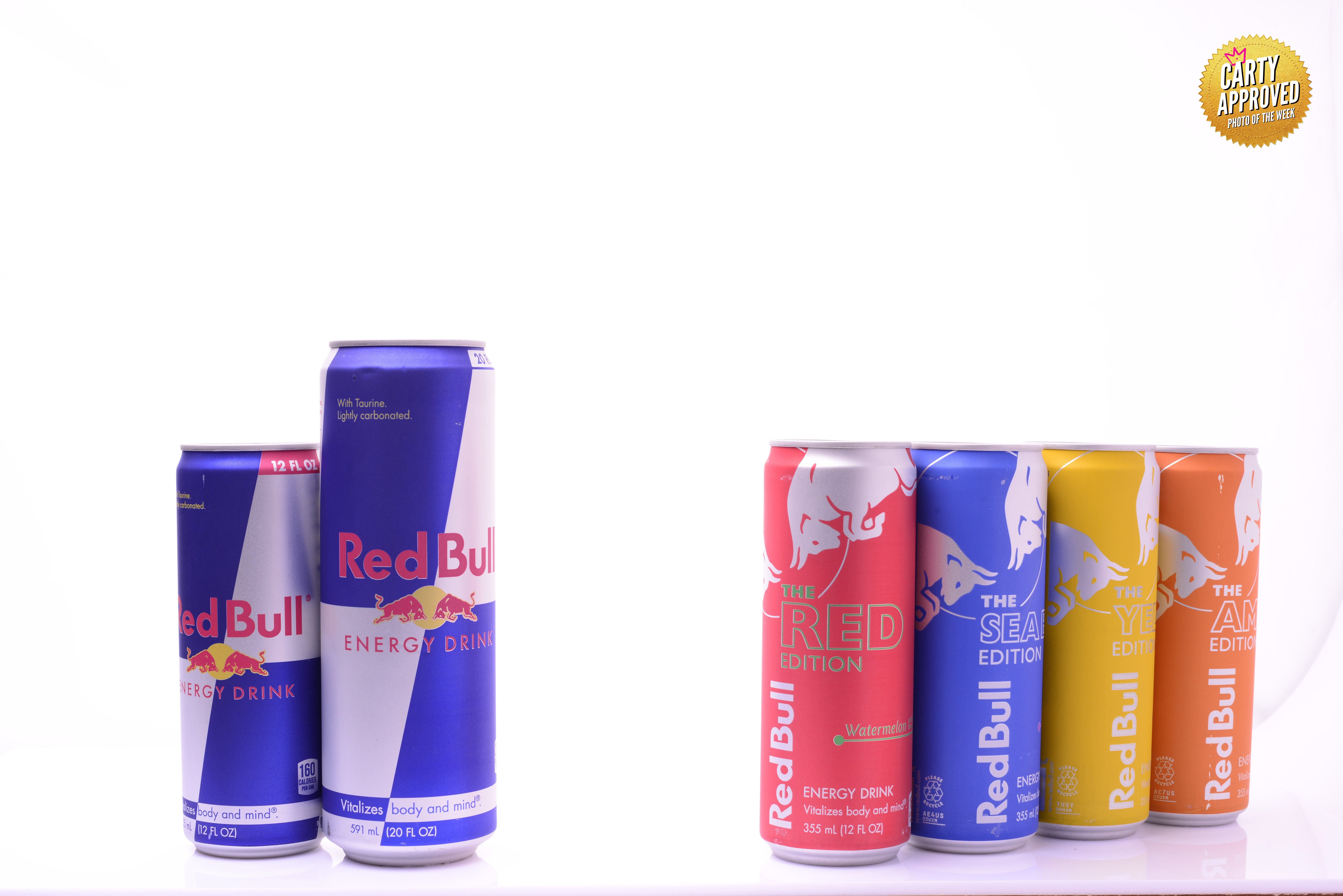
Visually show red bulls expansion as a brand.
How did you approach composing the image to account for the gutter and ensure the subject remained uninterrupted?
I treated the horizontal borders separately.
I wanted to balance the space on the left page, to “centre” that side of the image, and the right page separately, because the size of the images was so different
How did you guide the viewer’s eye from one side of the image to the other?
Using a “Wedge” to expand from centre to outer edges.
Was there a photographer or editorial spread that influenced your approach? If so, who?
I went to Behance for inspiration, but found that many of red bulls promient ads were action shots or a.i. enhanced images.
So I used Carty’s guidelines for laying out the image with my idea for showing product variety.
What elements from that reference did you reinterpret in your own way?
Red Bull uses their “Matador Bulls” prominently on their labels, so my goal was to remove the glare of the metal, while highlighting “The Bulls”, in their own way on both sides.
Social Media Handles:
N/A
Necumba Booker Jr
What was the central idea or story you wanted to communicate across the full spread ?
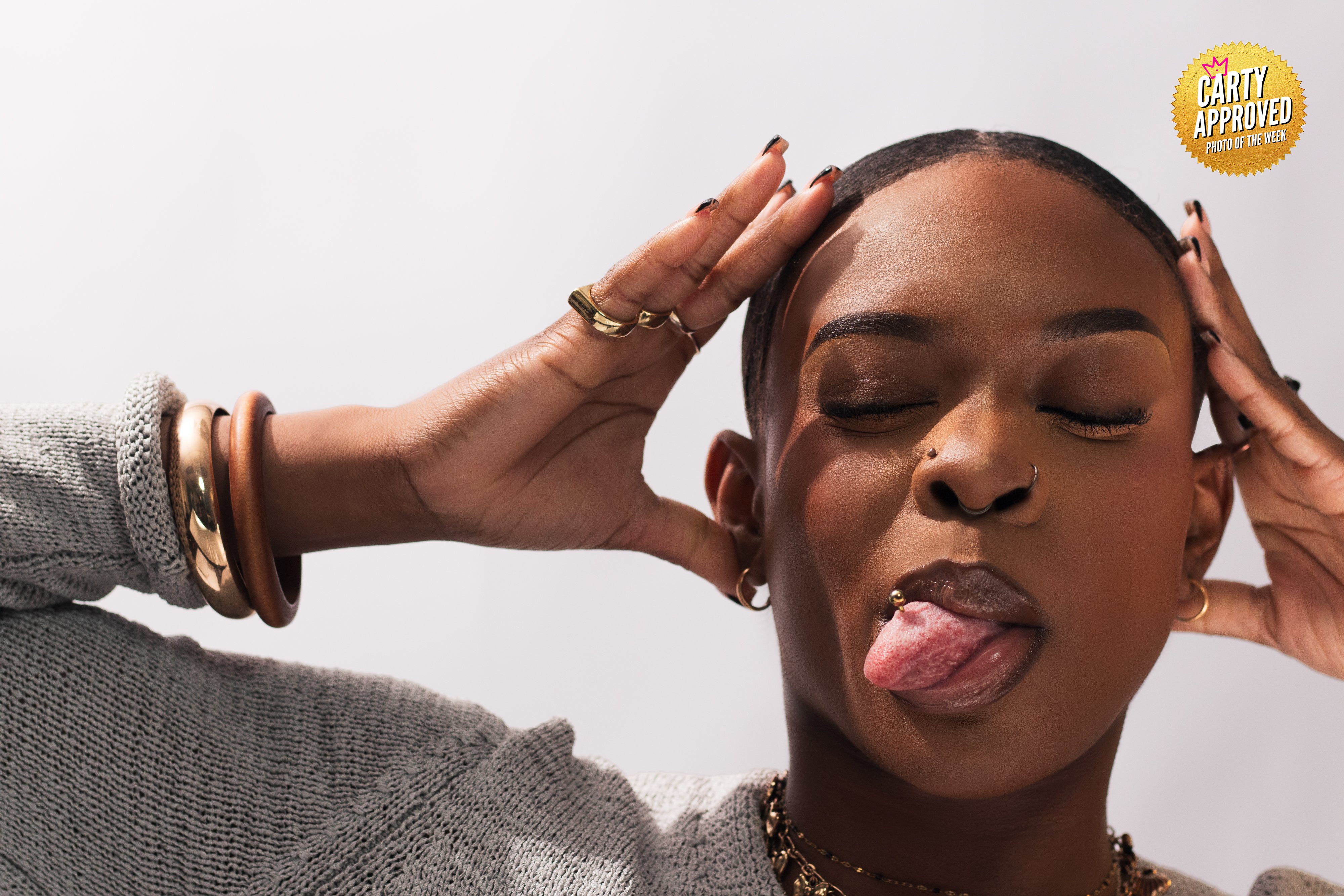
I was focused on the enjoyment/commercial aspect of the photos.
How did you approach composing the image to account for the gutter and ensure the subject remained uninterrupted?
I can picture where the gutter is I just usually struggle with the framing to the outside of the gutter.
How did you guide the viewer’s eye from one side of the image to the other?
I usually leave space since in my mind words would be on the other side.
Was there a photographer or editorial spread that influenced your approach? If so, who?
Allen Cooley’s bounce lighting for back light.
What elements from that reference did you reinterpret in your own way?
The pose.
Social Media Handles:
IG: bynecumba
Website: www.bynecumba.com
LinkedIn: Necumba Booker Jr.
Hal Banfield
What was the central idea or story you wanted to communicate across the full spread ?
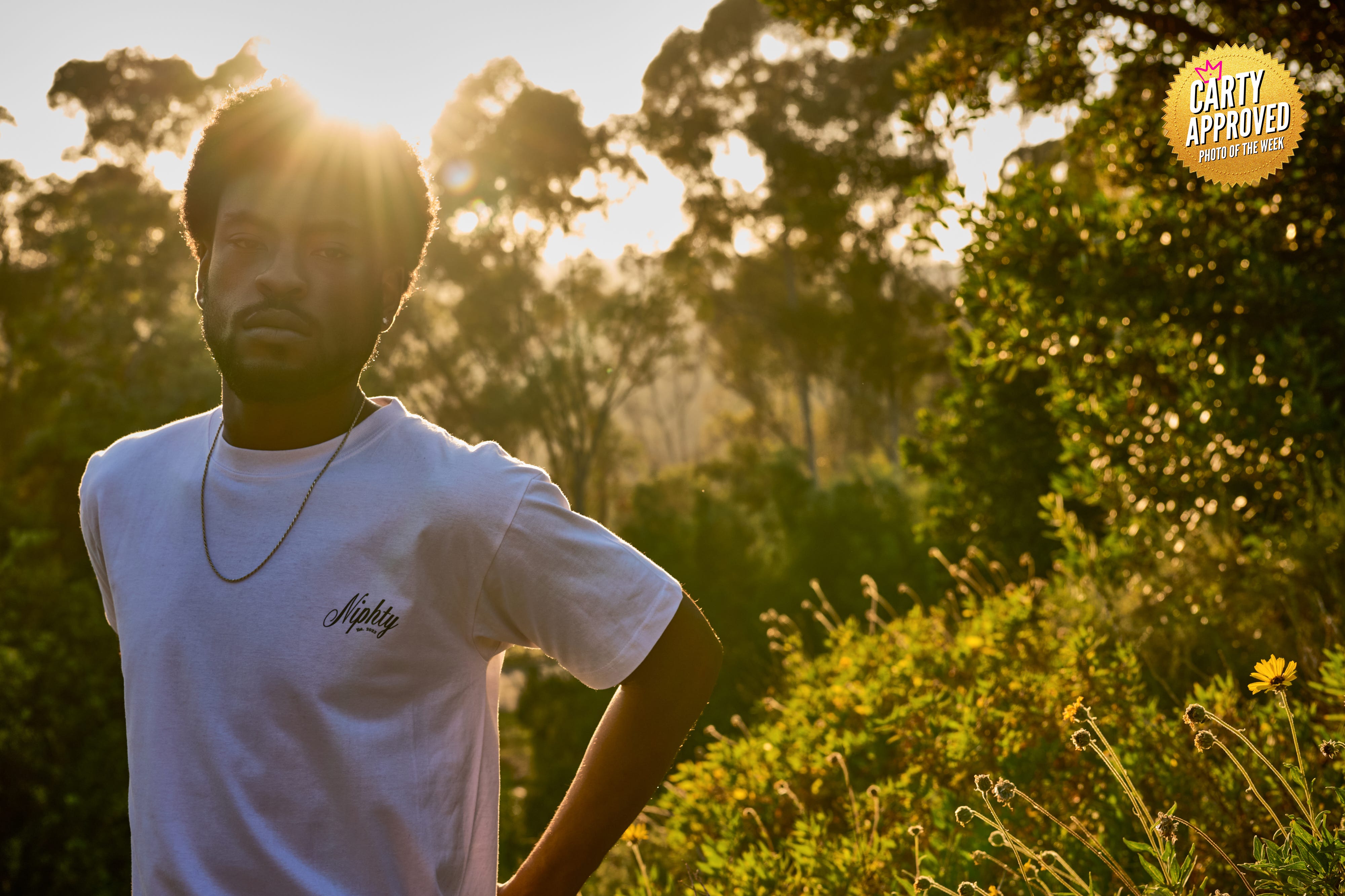
“Niphty in Nature” was the theme I was going for.
I rarely shoot out of the studio, and wanted an outdoor scenario.
It just so happened the model was not going to be available until late in the day.
We caught golden hour and decided to make it a part of the scene among a hiking trail instead of a more urban setting, which would have been a bit too obvious of a setup for the brand.
How did you approach composing the image to account for the gutter and ensure the subject remained uninterrupted?
The sun kept moving and so I wanted to really take advantage of the sun lowering in the horizon.
It took a bit of footwork on my part to position the sun behind the model to create the sunburst and lens flare.
For composition, I knew if I kept the model to the the extreme left of the frame, I could have the scene filling out the rest of the frame.
How did you guide the viewer’s eye from one side of the image to the other?
We read from left to right, so, keeping the model to the left of the frame, making sure the brand name was prominent, the viewer would identify the product and connect it to the place and energy of the scene.
Was there a photographer or editorial spread that influenced your approach? If so, who?
No one photographer, in particular, influenced my approach to this shot.
I live in Los Angeles, and I do my morning walks along the Sunset Strip.
Every day, I find inspiration from the large billboards I get to view, studying the various approaches to composition and lighting styles among all of the brand ads.
What elements from that reference did you reinterpret in your own way?
I am always trying to seek ways to evoke an emotion or mood.
I certainly knew that backlighting the model and using the sun as a visual element would achieve the effect I was going for.
I didn’t have my reflector with me to fill in shadows, so, the true challenge was exposing enough so that the model was not in total silhouette, and the logo on the t-shirt was legible.
Social Media Handles:
IG: halbanphotography
Website: halbanphotography.com
LinkedIn: hal-banfield
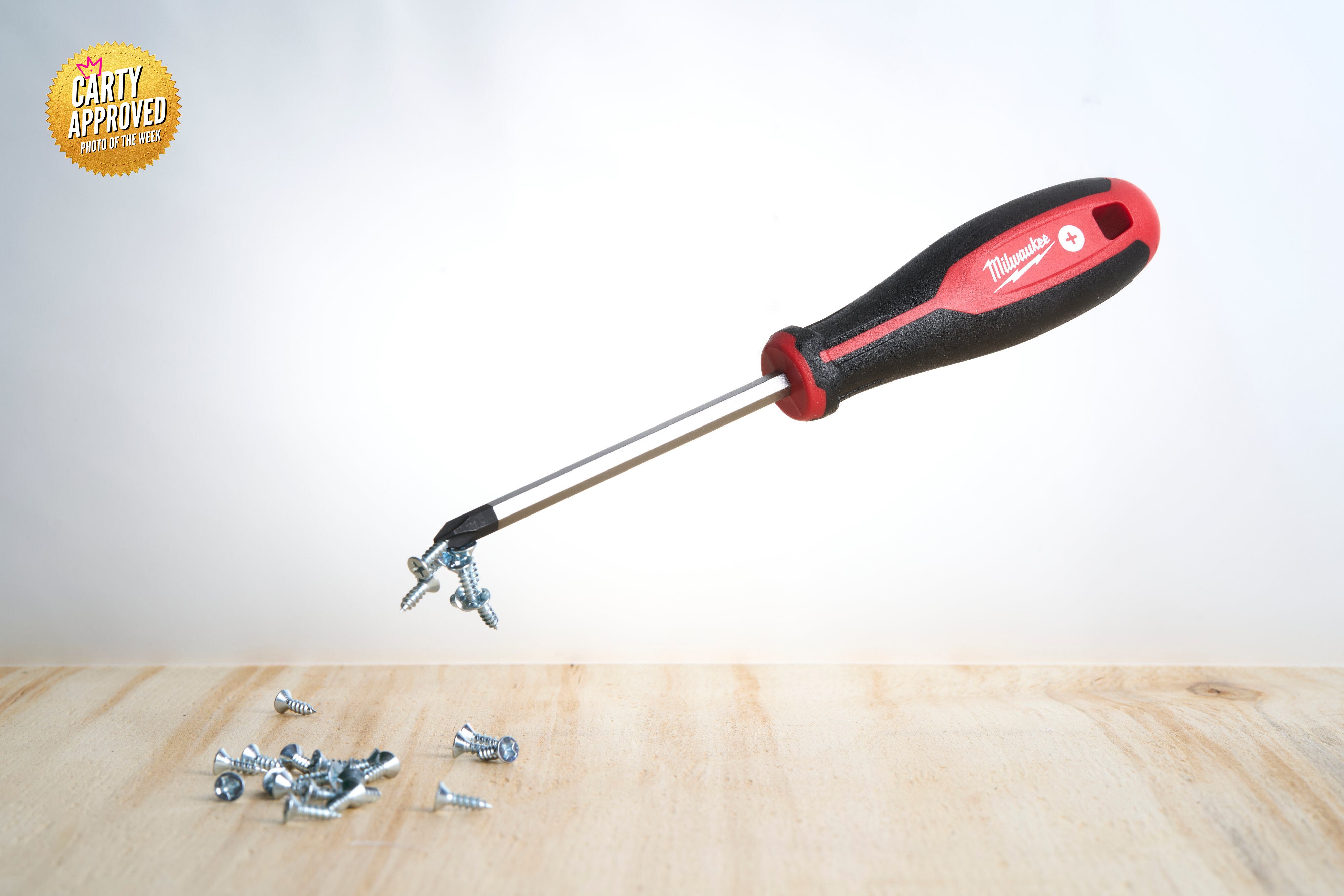
Allison Diller
What was the central idea or story you wanted to communicate across the full spread ?
I wanted to find a way to show the magnetized tip on the screwdriver.
How did you approach composing the image to account for the gutter and ensure the subject remained uninterrupted?
I balanced the image visually, keeping key aspects of the image away from the center fold line. Each page has one central area of focus.
How did you guide the viewer’s eye from one side of the image to the other?
I wanted to give some movement in the photo, so I didn’t place the screwdriver perfectly horizontal.
The page on the left shows the main part of the action...the magnetic tip...and the page on the right reveals the brand.
Was there a photographer or editorial spread that influenced your approach? If so, who?
I love drawing inspiration from other genres...fashion, food, etc. For this one, I was thinking about the levitation technique often used in food photography.
What elements from that reference did you reinterpret in your own way?
Applying to this specific tool, there wasn’t a need to make more than the screwdriver float.
But I’m thinking about pulling apart one of my power tools in the future to create a more complex photo!
Social Media Handles:
IG: allisondiller
Website: allisondiller.com
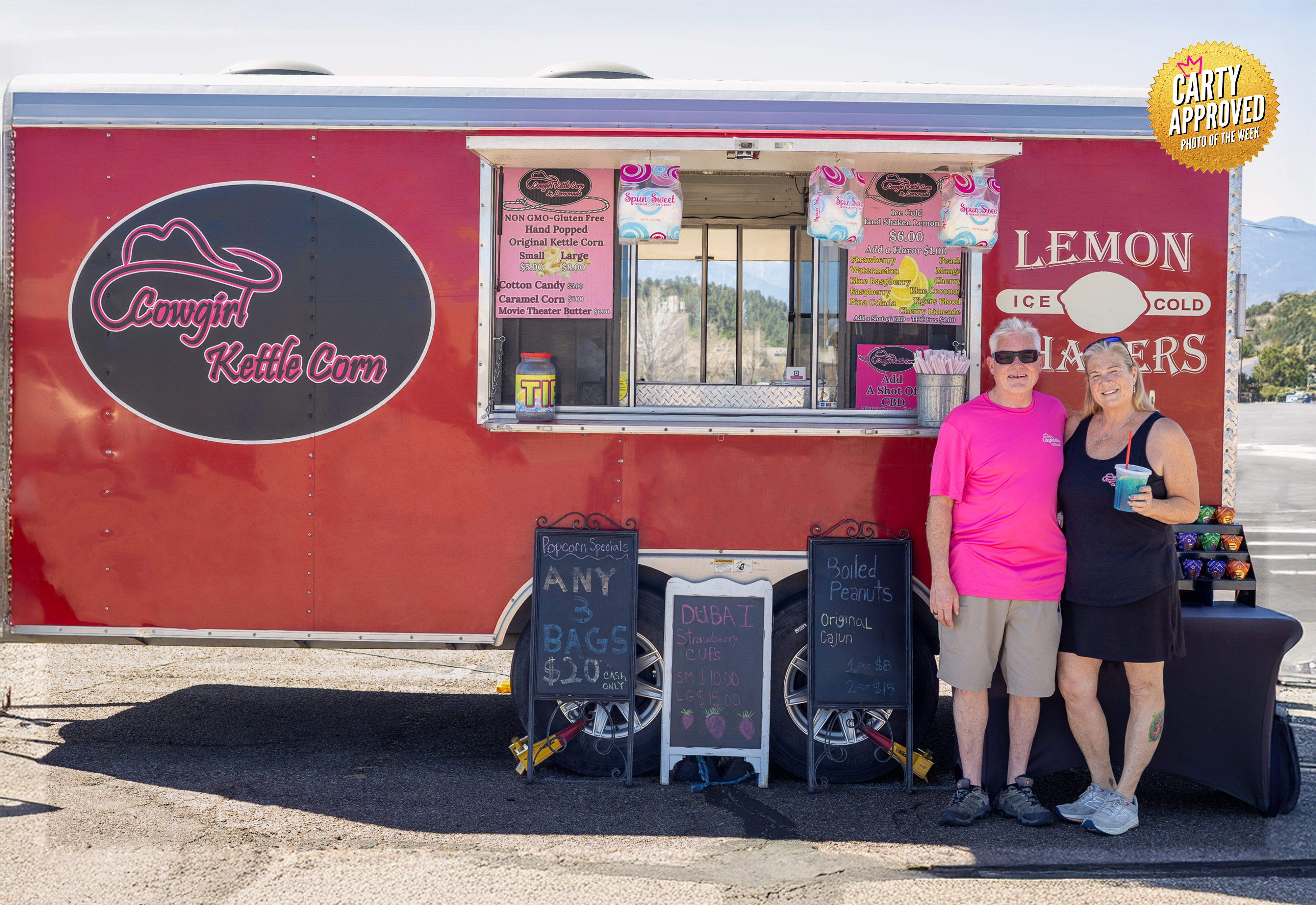
Michael Walls
What was the central idea or story you wanted to communicate across the full spread ?
I wanted to give them a photo for their header image on their website and socials.
How did you approach composing the image to account for the gutter and ensure the subject remained uninterrupted?
I wanted to centre the window on the truck to fall into the gutter and seemed to be the middle of the scene at that time.
How did you guide the viewer’s eye from one side of the image to the other?
I wanted to have their logo to be a hero on one side by itself and just lucked out that the logo is on the left side of the trailer like we read from left to right.
Then I wanted to get the owners in as much shape as possible that was provided from the overhang to the window.
Was there a photographer or editorial spread that influenced your approach? If so, who?
No there was not, I just adjusted to the scene. Looking for references, I was having trouble finding a double page example of a food truck.
I was finding a lot of photos that would make good billboard style with the subjects in the centre.
What elements from that reference did you reinterpret in your own way?
I just moved the owners camera right to even out the scene
Social Media Handles:
IG: wallsofmemoriesphotograhpy
Website: michaelwallsphotography.com
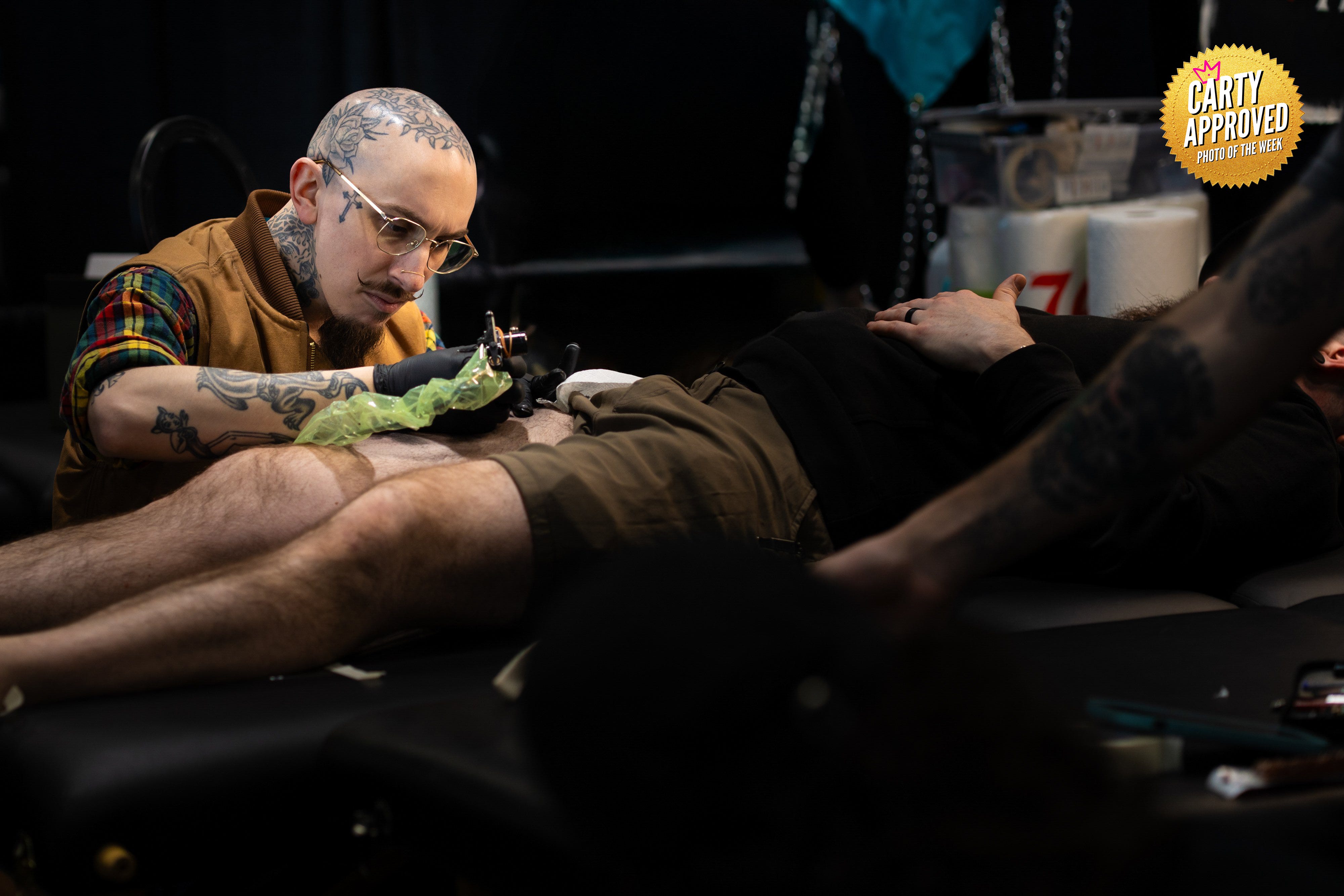
Jim Sinicki
What was the central idea or story you wanted to communicate across the full spread ?
I’ve really been pushing Small businesses and branding for small businesses in my work lately and I live tattoo artists.
I wanted to show the concentration my subject had while tattooing.
How did you approach composing the image to account for the gutter and ensure the subject remained uninterrupted?
Visualization is everything when I shoot for a client. Before I even break out my camera I try to find a spot where I could shoot to get the composition I wanted.
I saw he was heavy left which left me enough space to tell the story on the right hand side.
How did you guide the viewer’s eye from one side of the image to the other?
My client’s client was laying flat and made for a natural leading line cutting across two pages and as soon as I saw that, I knew I could use the leading lines to help guide my photo.
Was there a photographer or editorial spread that influenced your approach? If so, who?
I wouldn’t say there’s any ONE particular photographer off the top of my head, no.
This was one of those just rely on what you know situations so I would probably say it was more of a lot of my influences coming together at one time.
What elements from that reference did you reinterpret in your own way?
n/a
Social Media Handles:
IG: charlie_james_photo
Website: www.charliejamesphoto.com
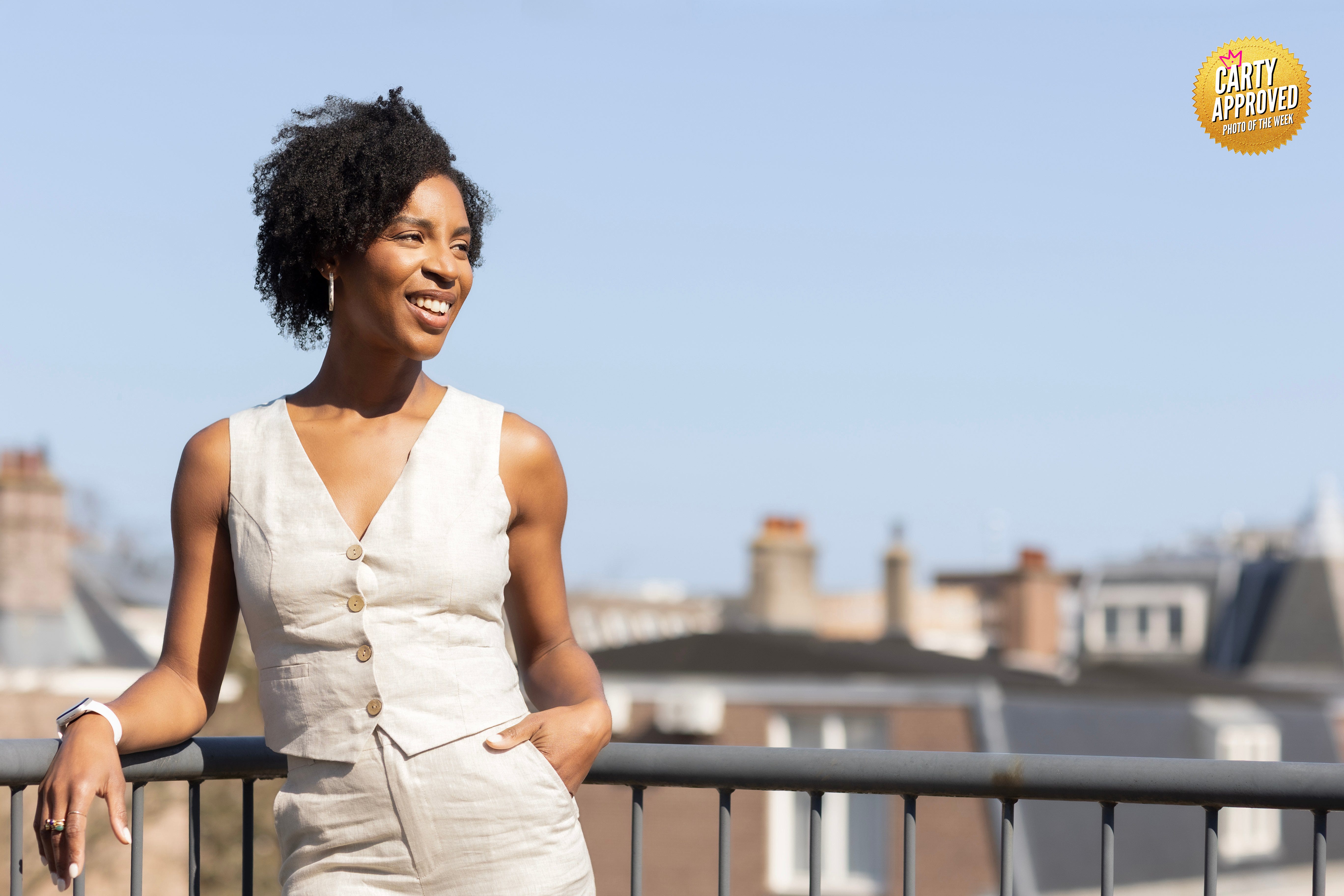
Mira Lee
What was the central idea or story you wanted to communicate across the full spread ?
A light, laid-back yet professional entrepreneurial spirit.
This business woman is targeting the real estate market, so the location was chosen to reach and connect with her specific audience.
How did you approach composing the image to account for the gutter and ensure the subject remained uninterrupted?
I carefully considered the gutter when composing the image and positioned her arms within the left-hand frame of the spread to avoid disruption.
We also tried poses with her arms stretched out over the railing, which looked great in the scene, but would have cut off the arms.
Therefore I directed her to keep them closer to her body while looking natural and relaxed.
How did you guide the viewer’s eye from one side of the image to the other?
By choosing an interesting background that adds depth and context to the story. The rooftops of the residential houses keep the scene versatile and aligned with the real estate market, without distracting from the main subject.
Was there a photographer or editorial spread that influenced your approach? If so, who?
I had a vision of how I wanted to capture her high-spirited personality while keeping her target audience in mind.
This idea brought the composition to life, rather than being influenced by external sources.
What elements from that reference did you reinterpret in your own way?
My reference was my own vision. I explored various locations, poses, lighting, and expressions to give it form and shape.
This photo expressed precisely the vibe I was looking for.
Social Media Handles:
IG: miralee.photography
Website: miralee.nl
Sonny Warren
What was the central idea or story you wanted to communicate across the full spread ?
I wanted to showcase the owner and motto of the local brand and create interest in the store location.
How did you approach composing the image to account for the gutter and ensure the subject remained uninterrupted?
I essentially cut the frame into 1/4 vertically and tried to make two portrait photos in the one horizontal frame.
I looked to have points of interest prominently framed on both sides of the gutter.
How did you guide the viewer’s eye from one side of the image to the other?
By filling the frame and having layers of interest through the photo
Was there a photographer or editorial spread that influenced your approach? If so, who?
n/a
What elements from that reference did you reinterpret in your own way?
n/a
Social Media Handles:
IG: sonnywarrenphoto
Website: sonnywarrenphoto.com
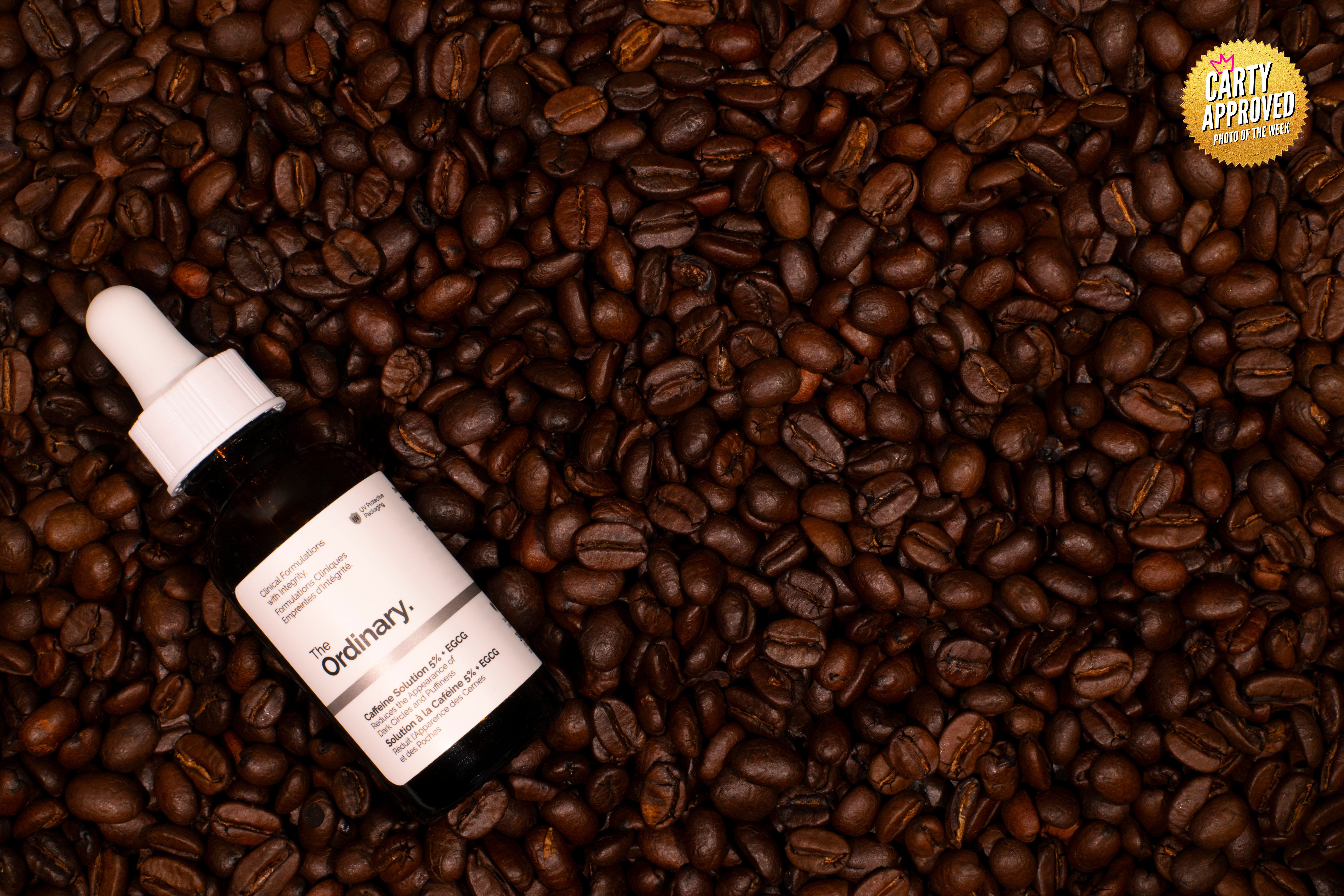
Denise Tuggle
What was the central idea or story you wanted to communicate across the full spread ?
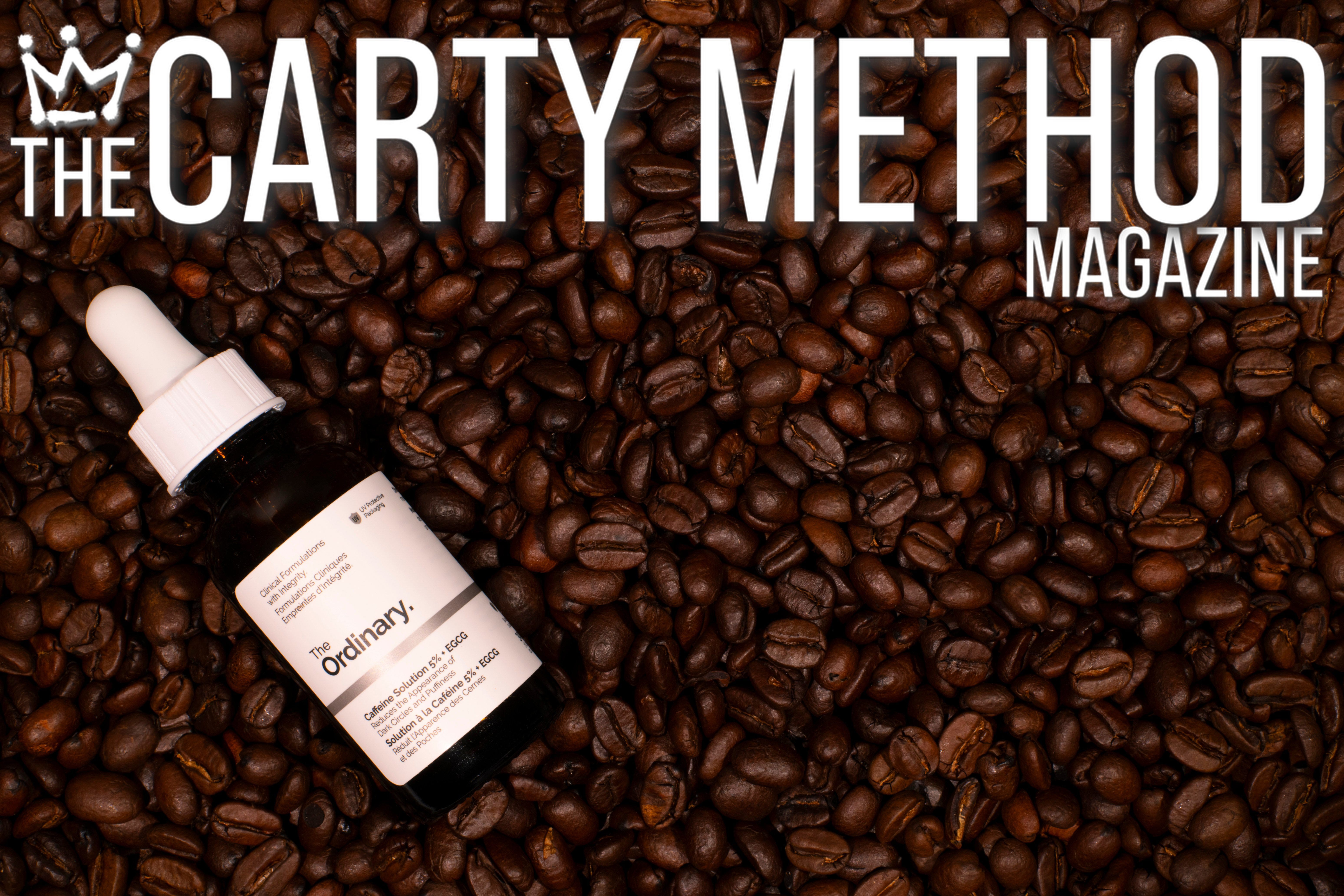
The central concept I aimed to communicate across the full spread was the prominence of coffee as the hero ingredient within the formula.
My intention was to showcase the product with clarity while strongly emphasizing caffeine as the key driver behind its effectiveness.
I also leaned into the natural association between caffeine and coffee, using that visual connection to reinforce the product’s core benefit in an intuitive and engaging way.
How did you approach composing the image to account for the gutter and ensure the subject remained uninterrupted?
My approach to composition was heavily influenced by my background in graphic design.
From the outset, I considered the spatial constraints of a full spread, including height, width, and gutter placement.
Rather than centring the product, I intentionally positioned it in a way that allowed it to stand independently without being compromised by the gutter.
This approach also created flexible negative space, particularly on the right side, which could be used for copy or to introduce additional product elements if needed.
How did you guide the viewer’s eye from one side of the image to the other?
I guided the viewer’s eye by placing the primary product on the left side of the composition, aligning with the natural left-to-right reading pattern.
The product is presented in its “natural state,” surrounded by a rich arrangement of coffee beans that visually anchor the concept.
The right side of the frame was intentionally left open to provide space for copy, additional products, or a combination of both.
This approach allows for versatility, supporting both single-page and double-page spread layouts while maintaining a cohesive visual flow.
Was there a photographer or editorial spread that influenced your approach? If so, who?
A significant influence on my approach is Raymond Meier.
I greatly admire his use of colour, spatial balance, and the way he gives products room to breathe within the frame.
His thoughtful integration of props that complement rather than compete with the subject is particularly impactful.
His work continues to inspire my creative process and often informs the direction of my mood boards.
What elements from that reference did you reinterpret in your own way?
Inspired by Meier’s work, I focused on creating a sense of balance through intentional use of space and carefully selected props.
I reinterpreted his approach by incorporating bold, textural elements such as the coffee beans to enhance the narrative while maintaining a clean and structured composition.
While his influence guided the overall aesthetic, I adapted it to align with my own visual style, ensuring the final image felt both refined and distinctly my own.
Social Media Handles:
IG: denisetphotography
Website: denisetugglephotography.com
Professional feedback will change your reality. Joining Portfolio Lab is the only way.
👉🏾 Carty a Pro Photographer, Director, and Educator based in Toronto, CA.
His goal is to educate and connect a global network of visual creators.
👉🏾 Masterclass Level Photography Business Education from a 35yr Pro 👈🏾 on YouTube
See work at 👉🏾 SteveCarty.com
Work with him 👉🏾 TheCartyMethod.com
Subscribe to The Carty Method Magazine to see the best new photographers from all over the world level up right before your eyes. Weekly photographer transformations are happening right now.
Become a smarter photographer in 5 minutes a week by Subscribing to CARTY on The Carty Method - Substack.
Watch the replay of these photo submissions below.